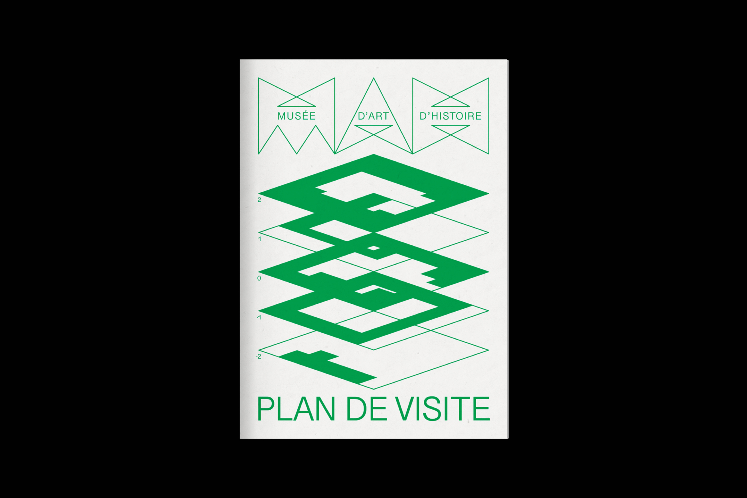
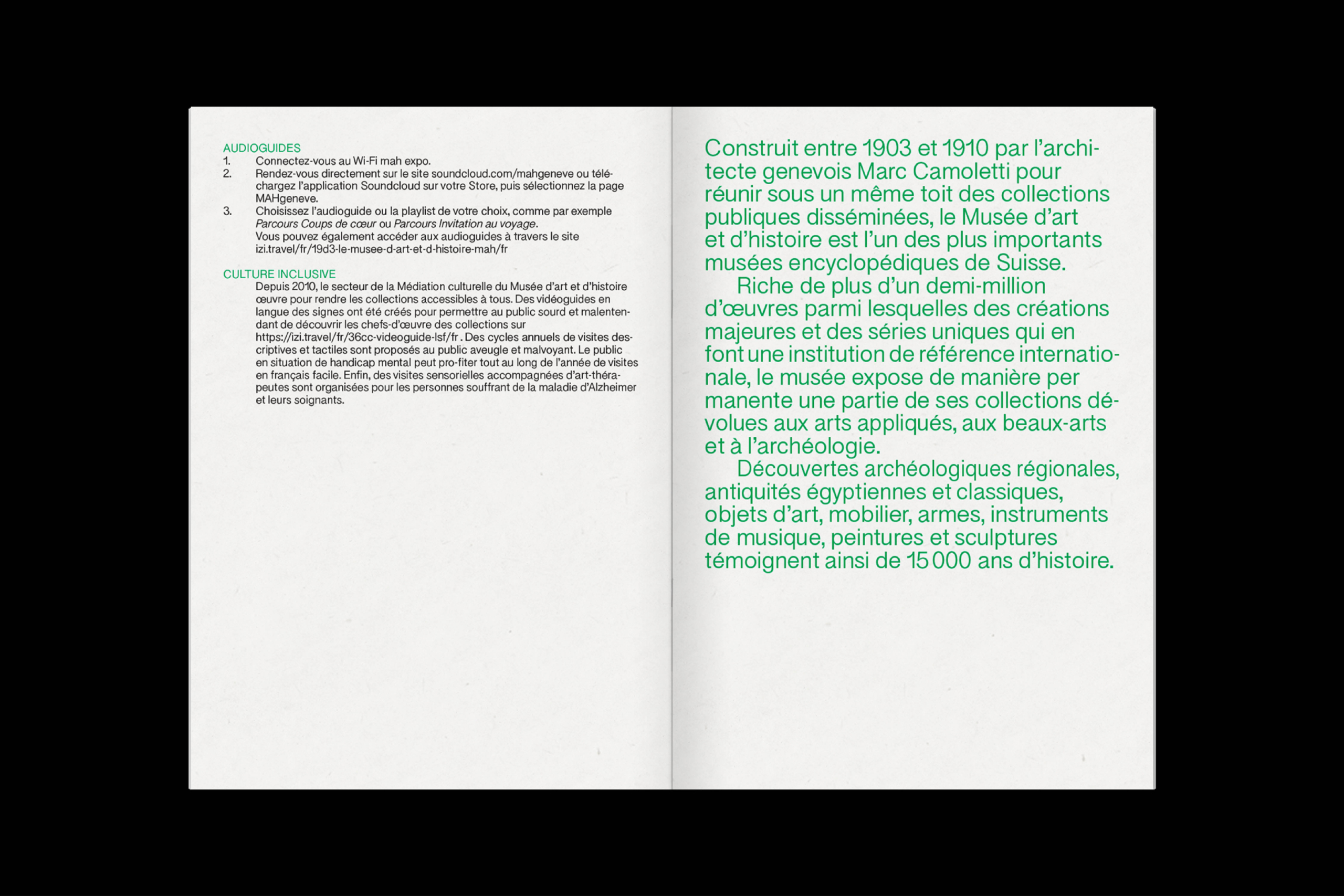
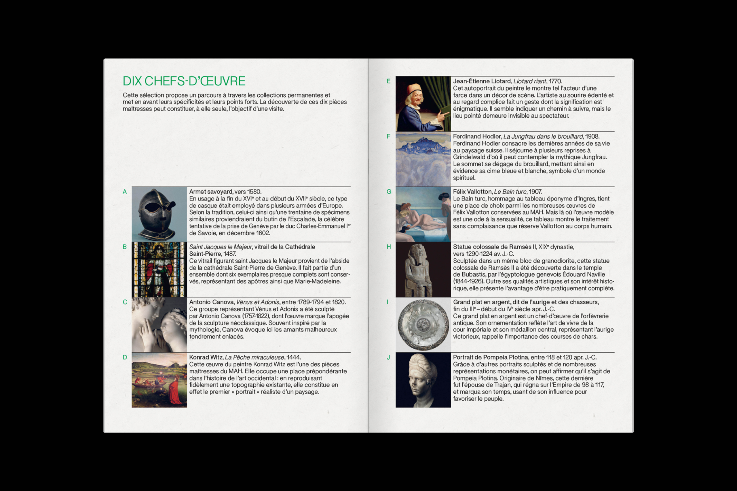
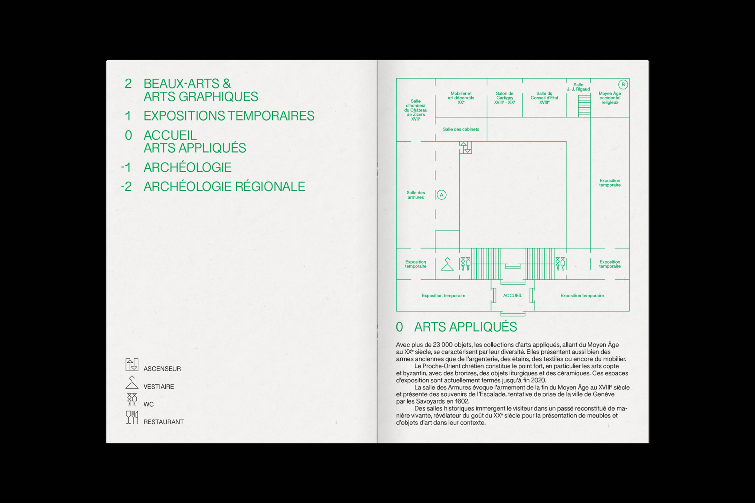
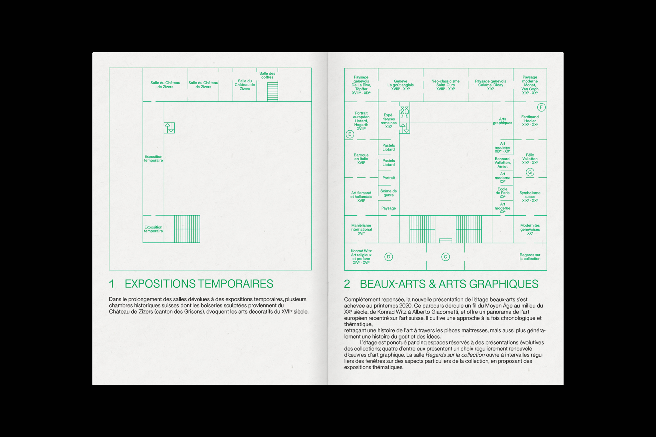
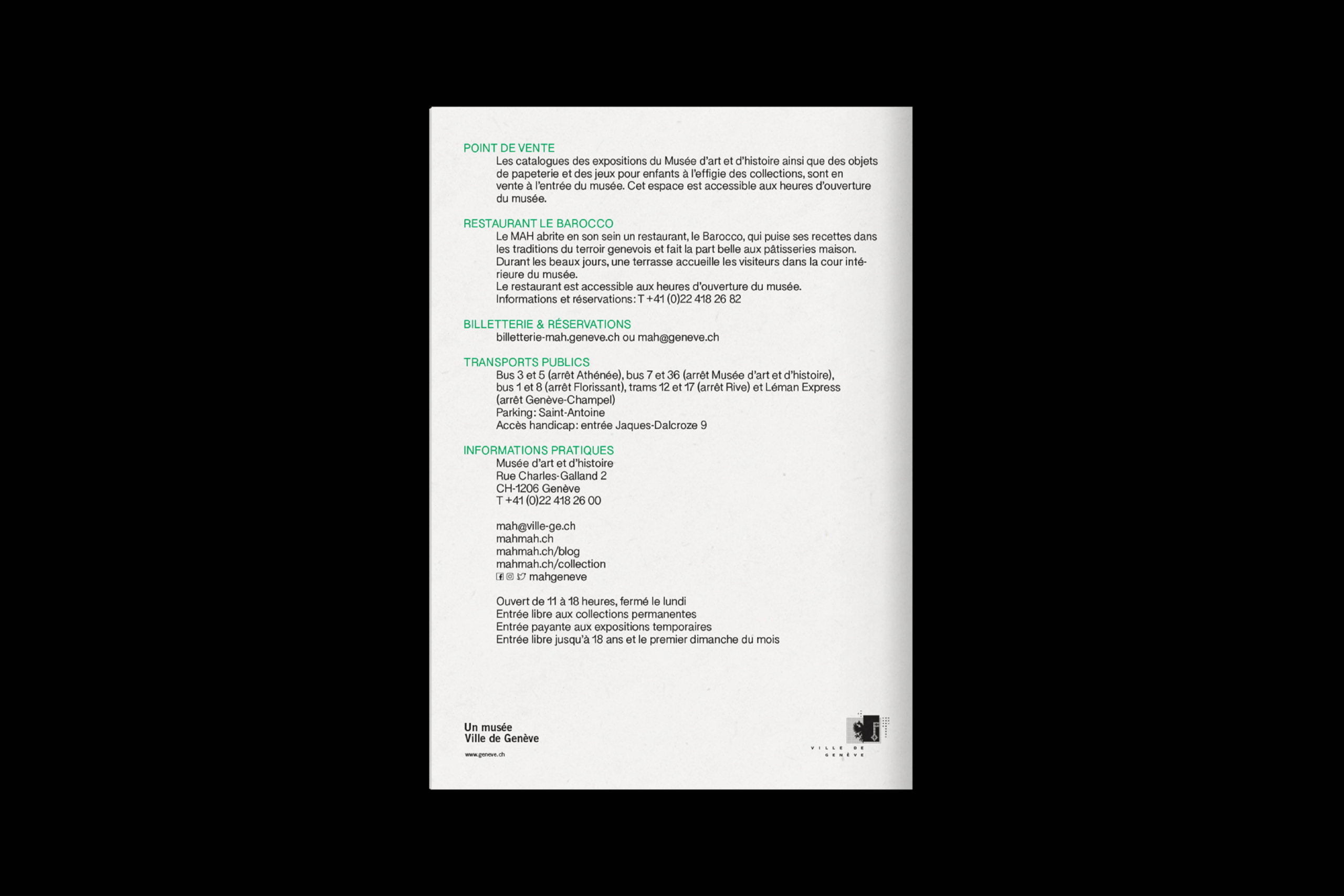
Musée d’art et d’histoire
About
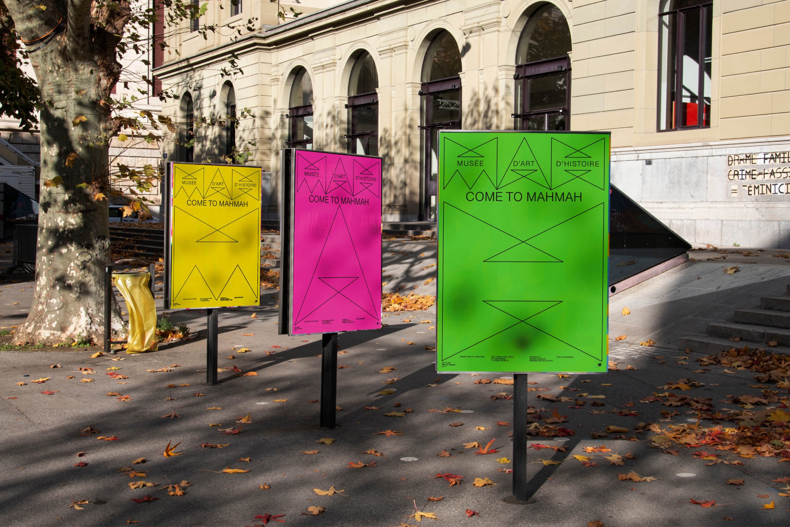
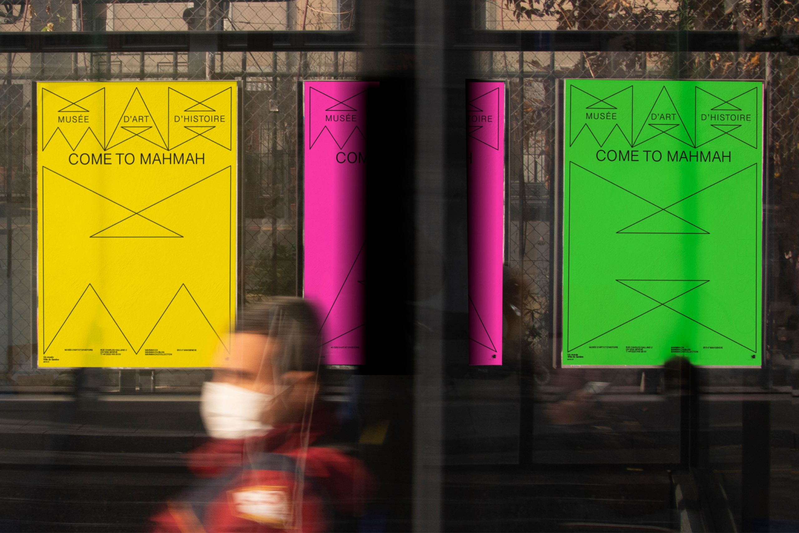
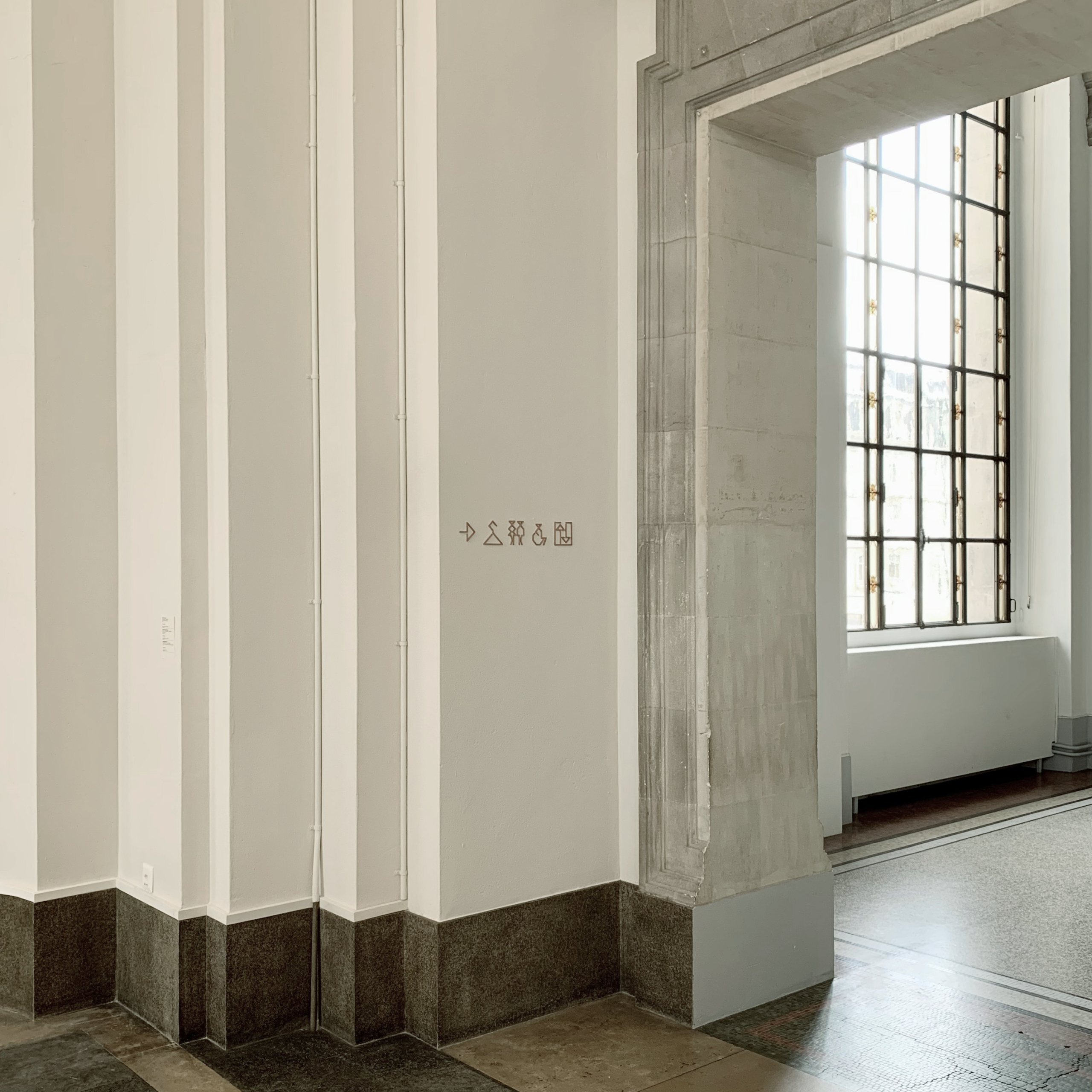
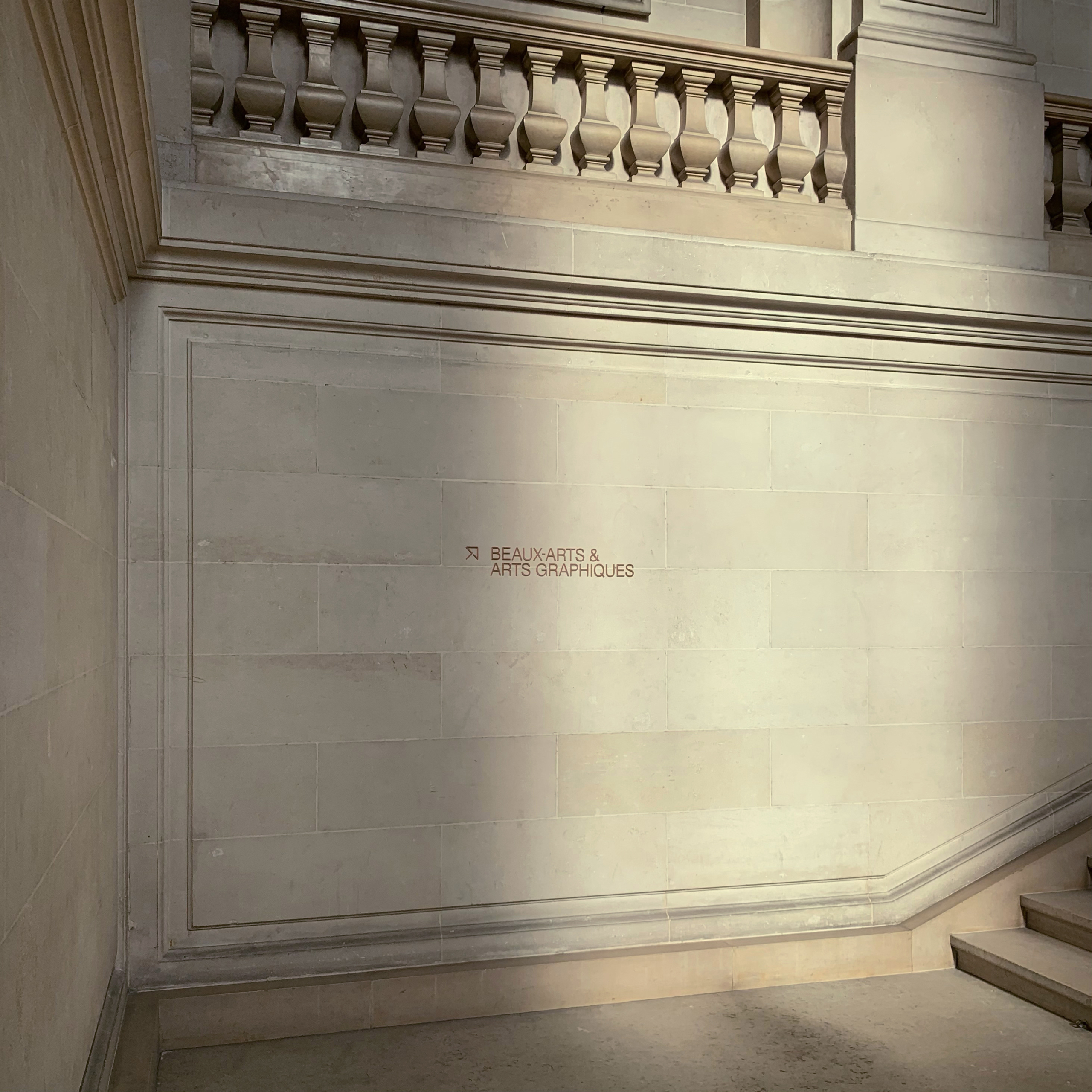
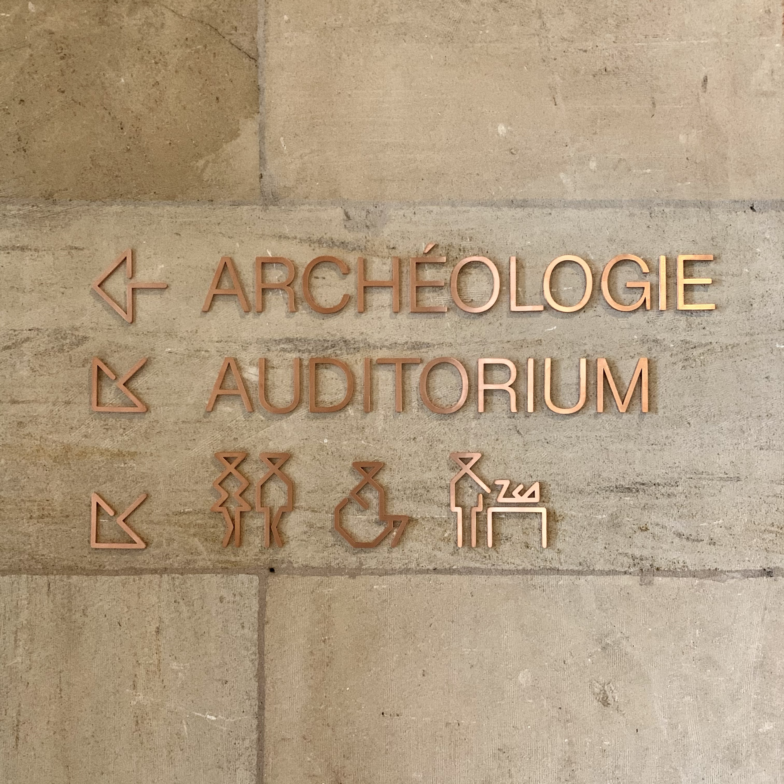
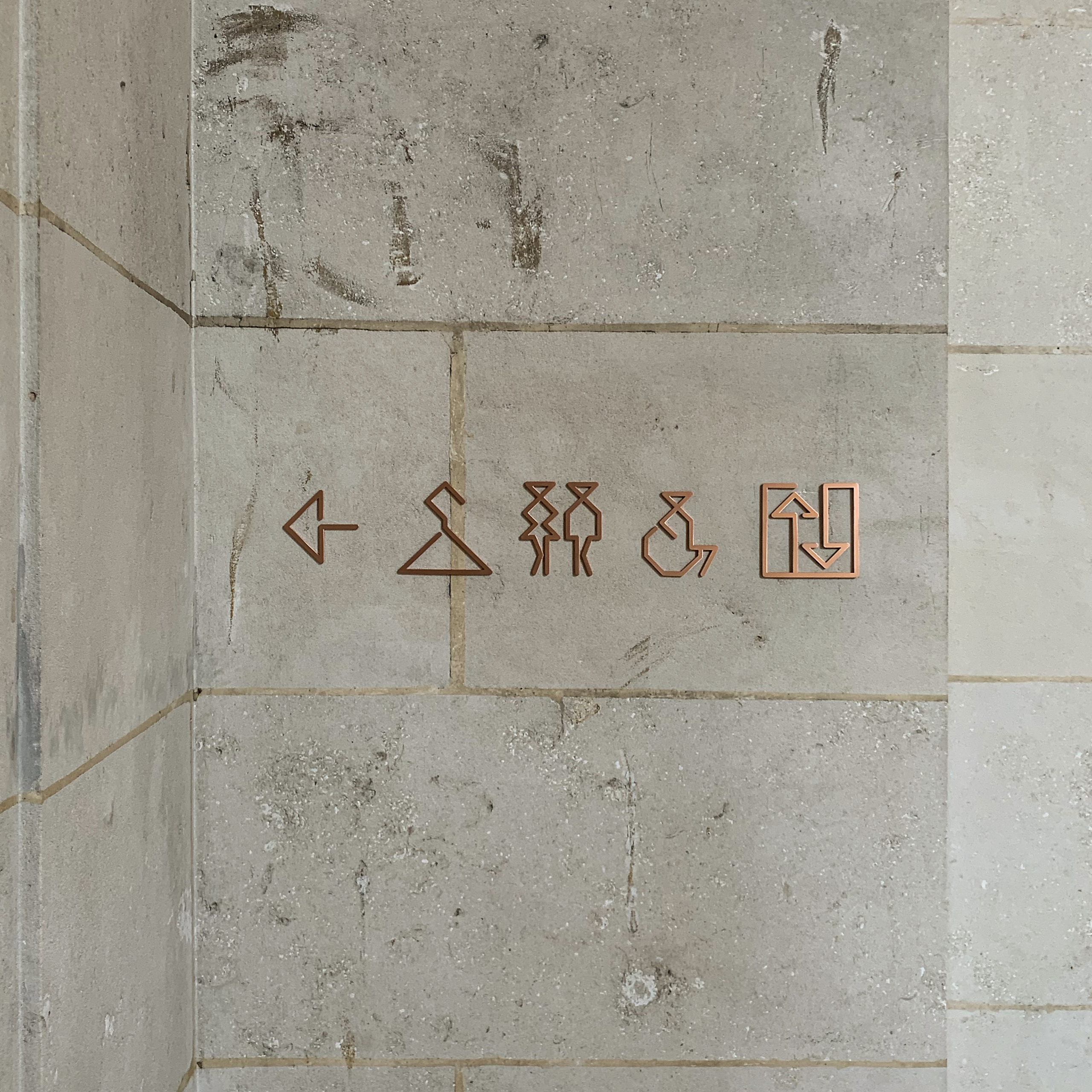
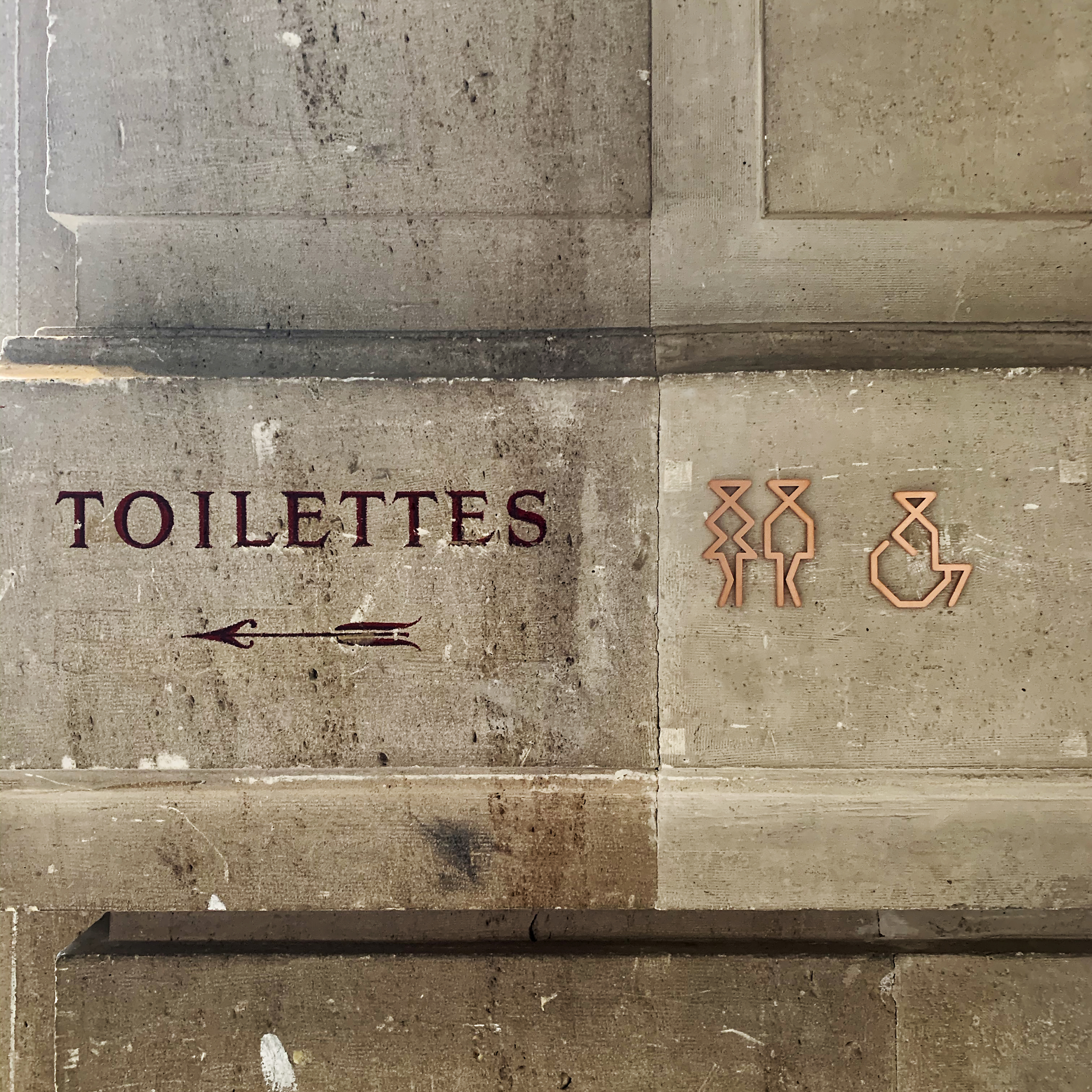
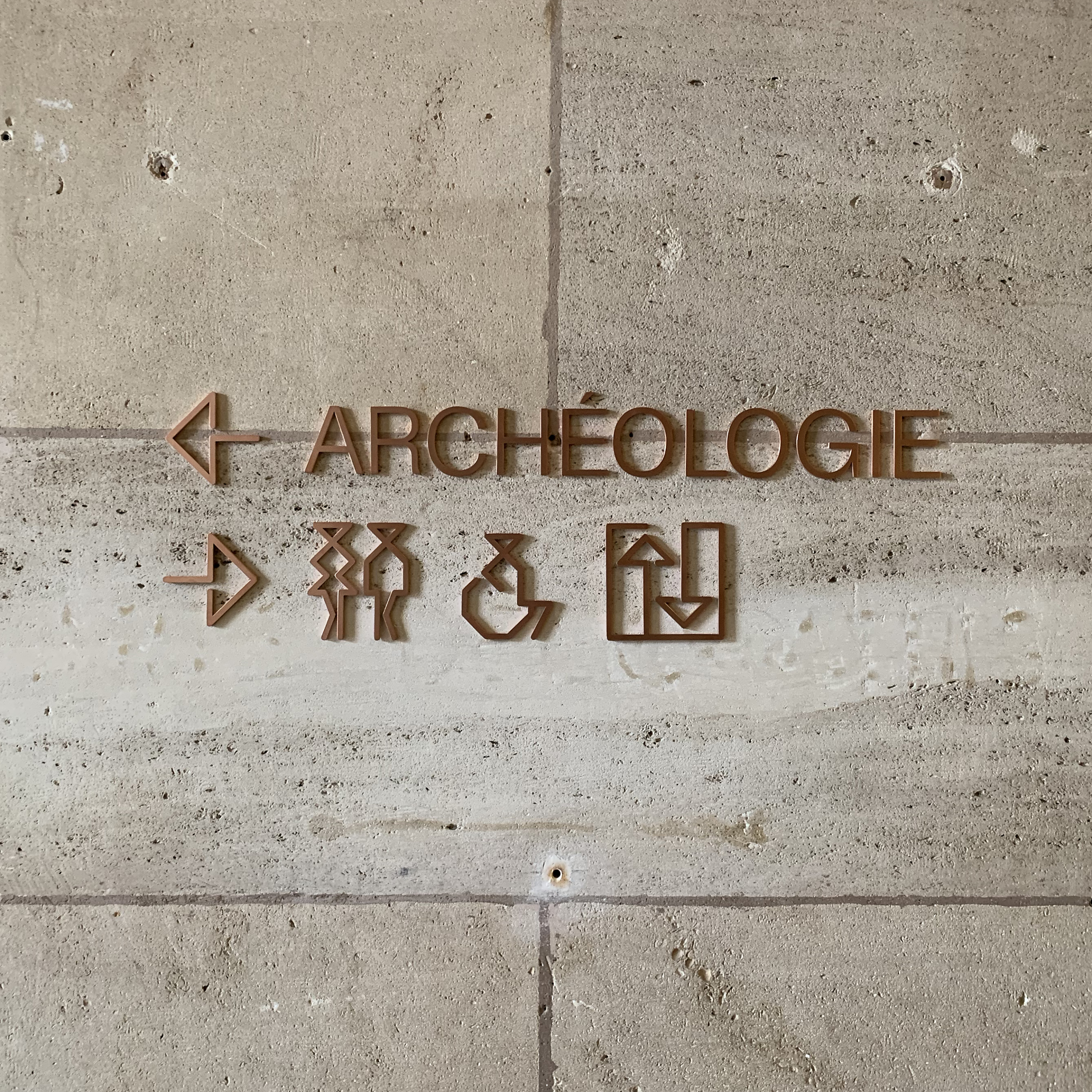
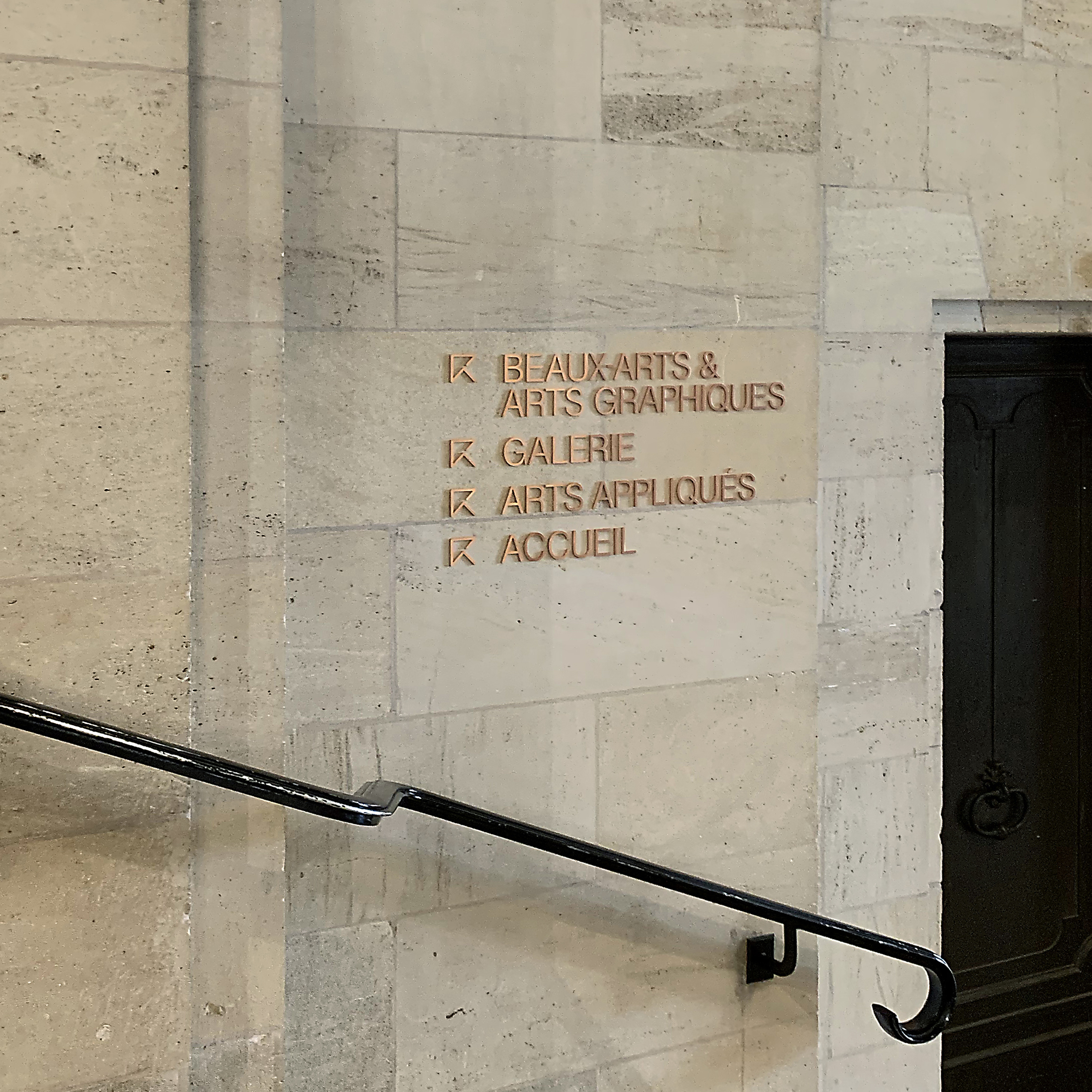
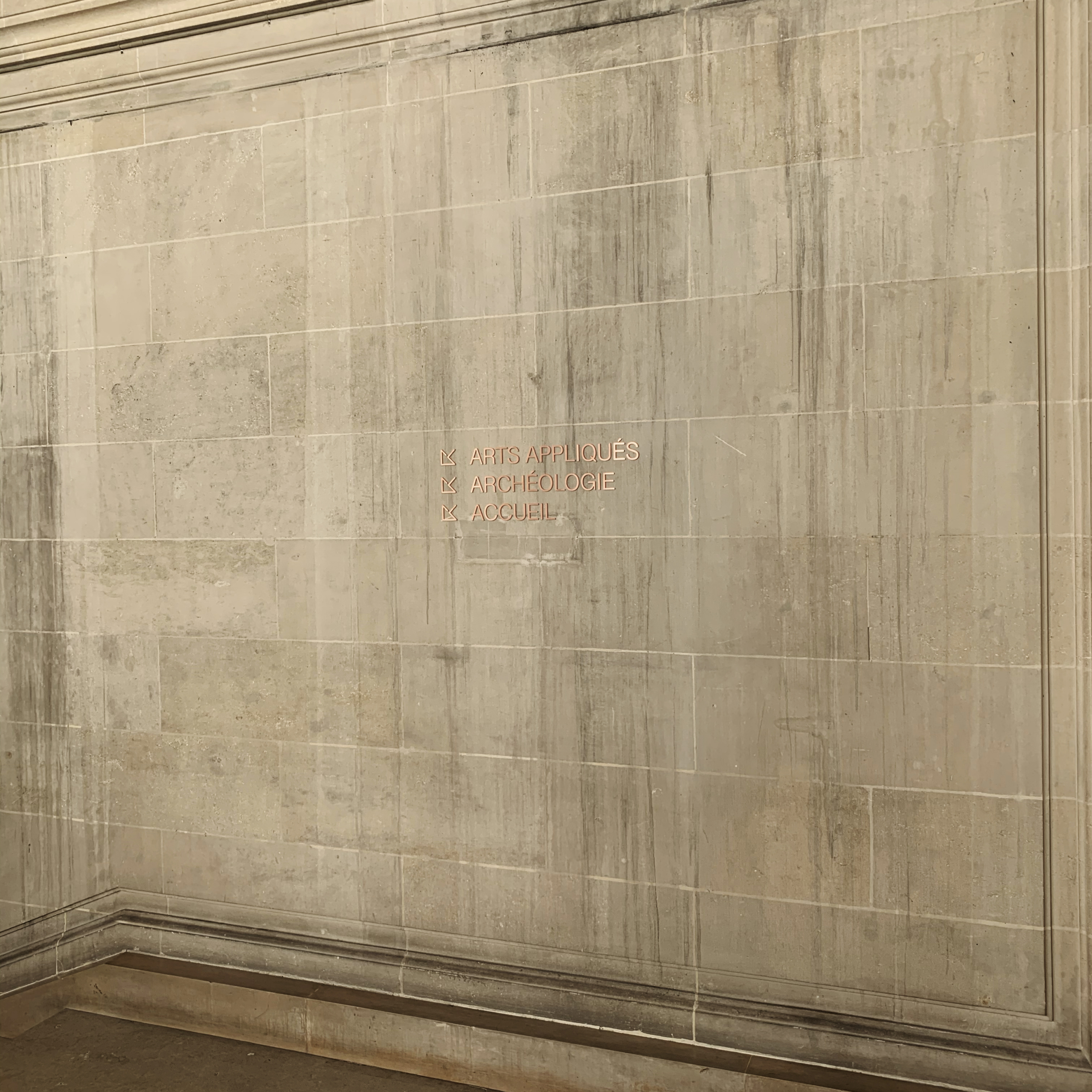
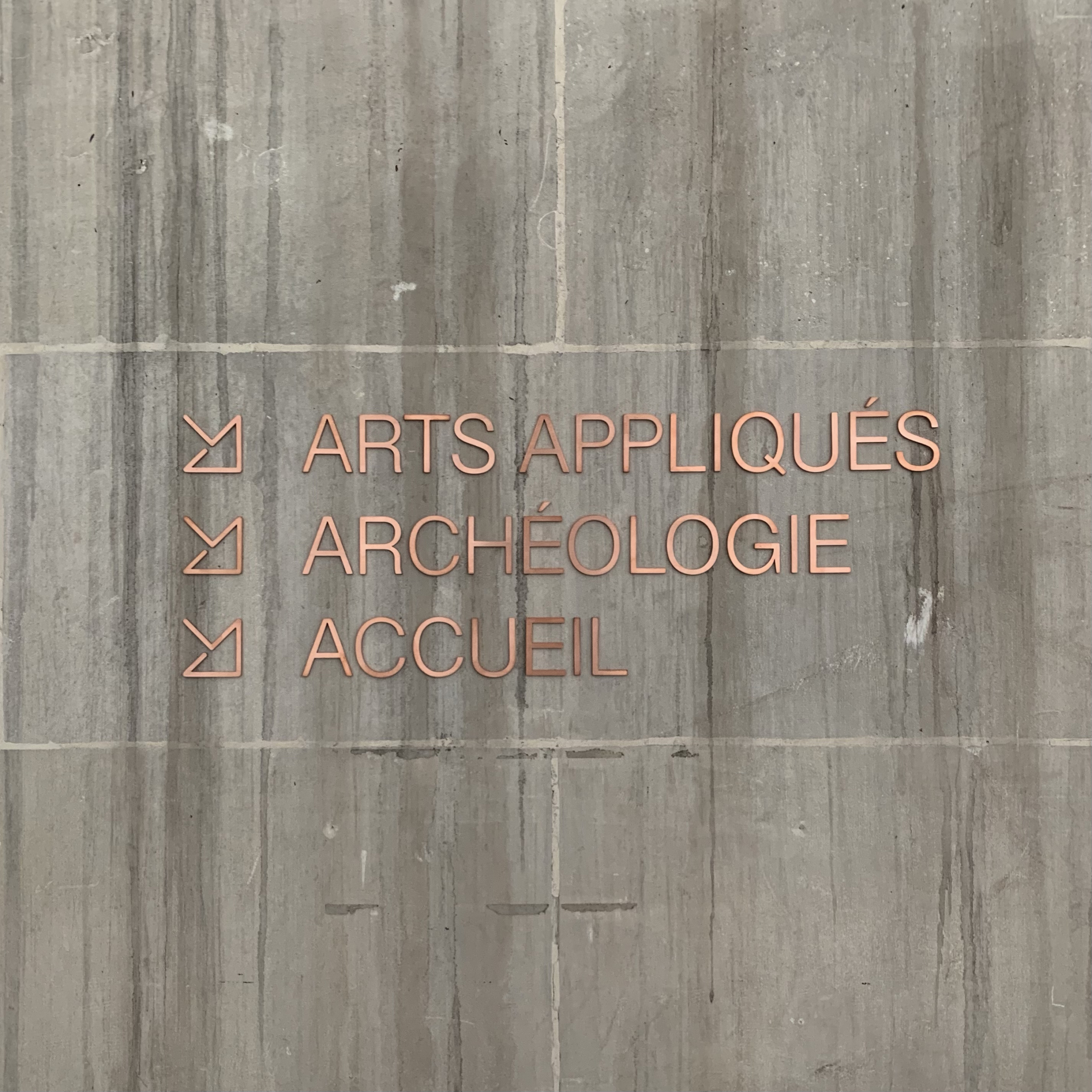
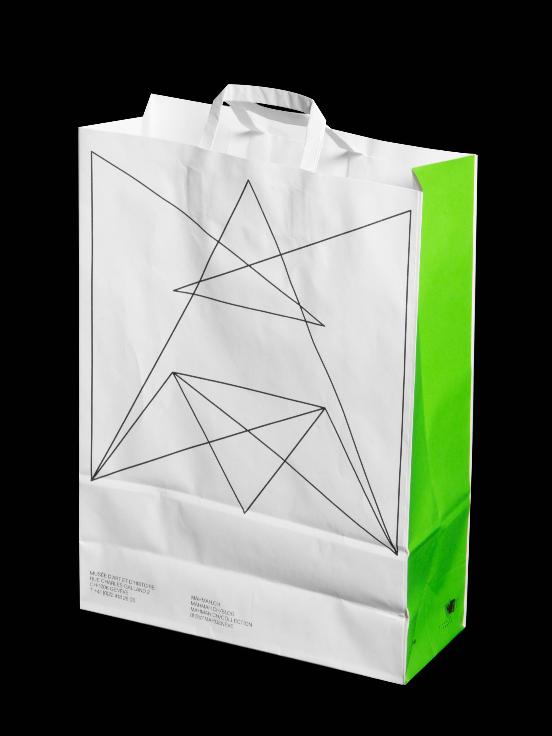
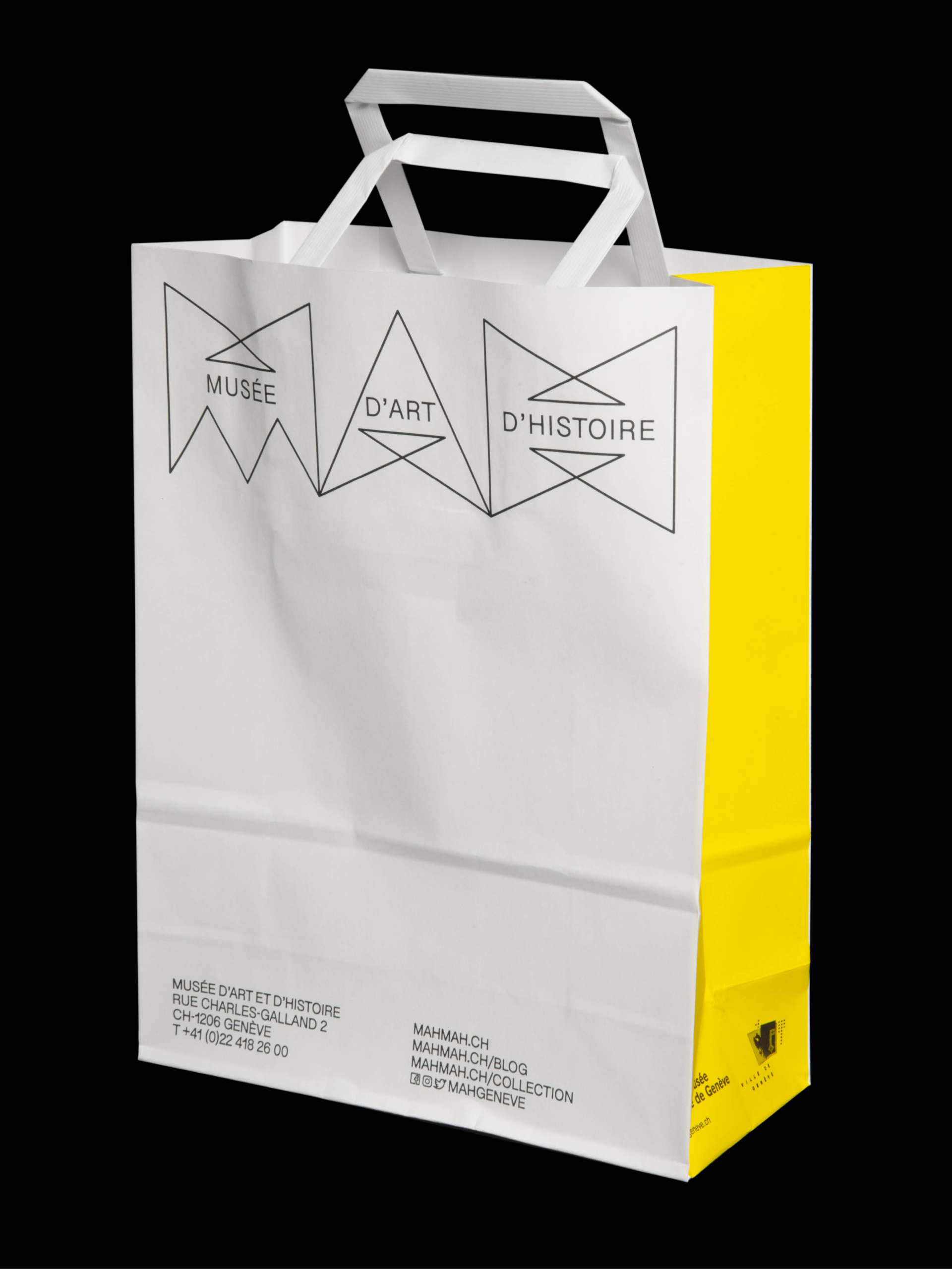
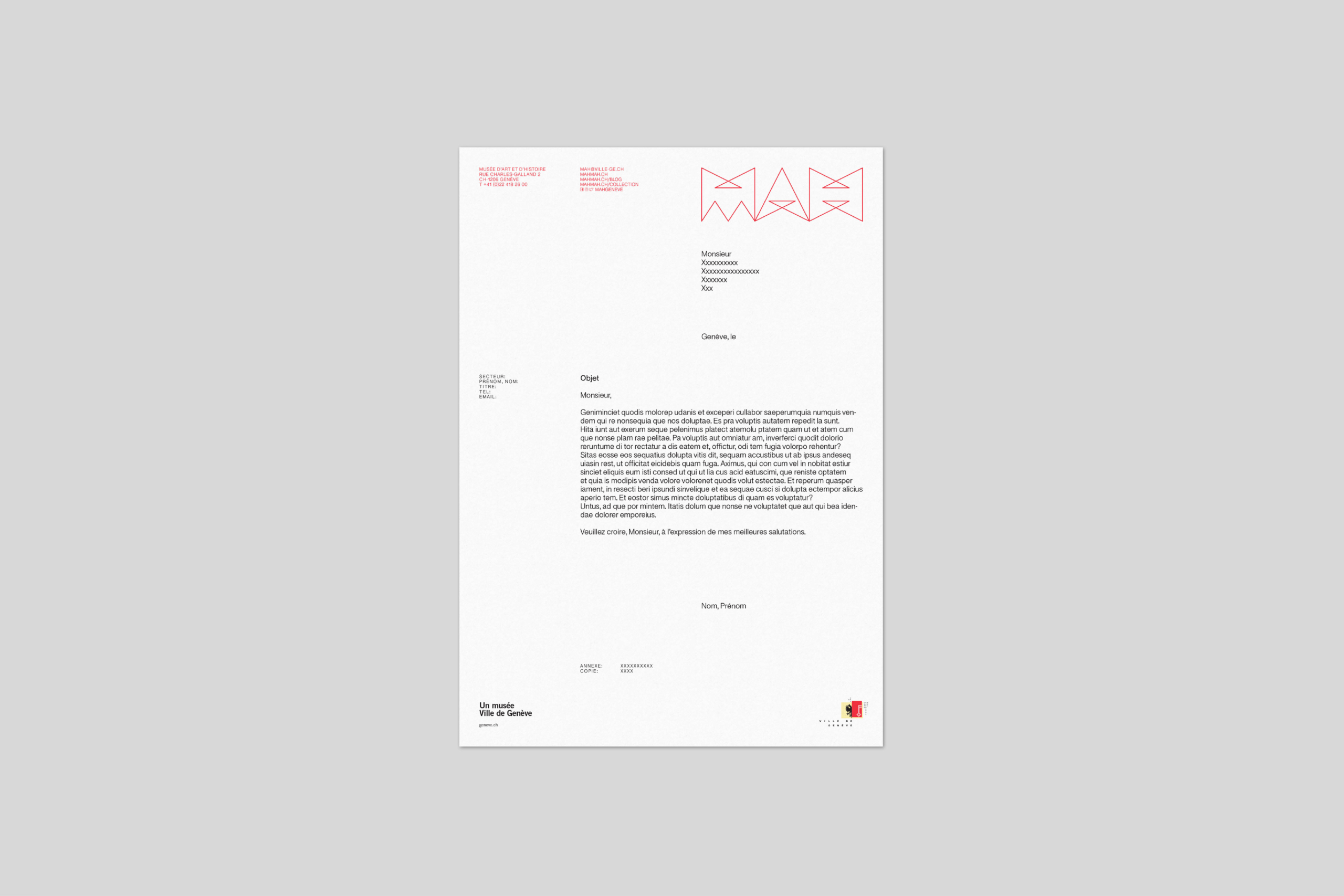
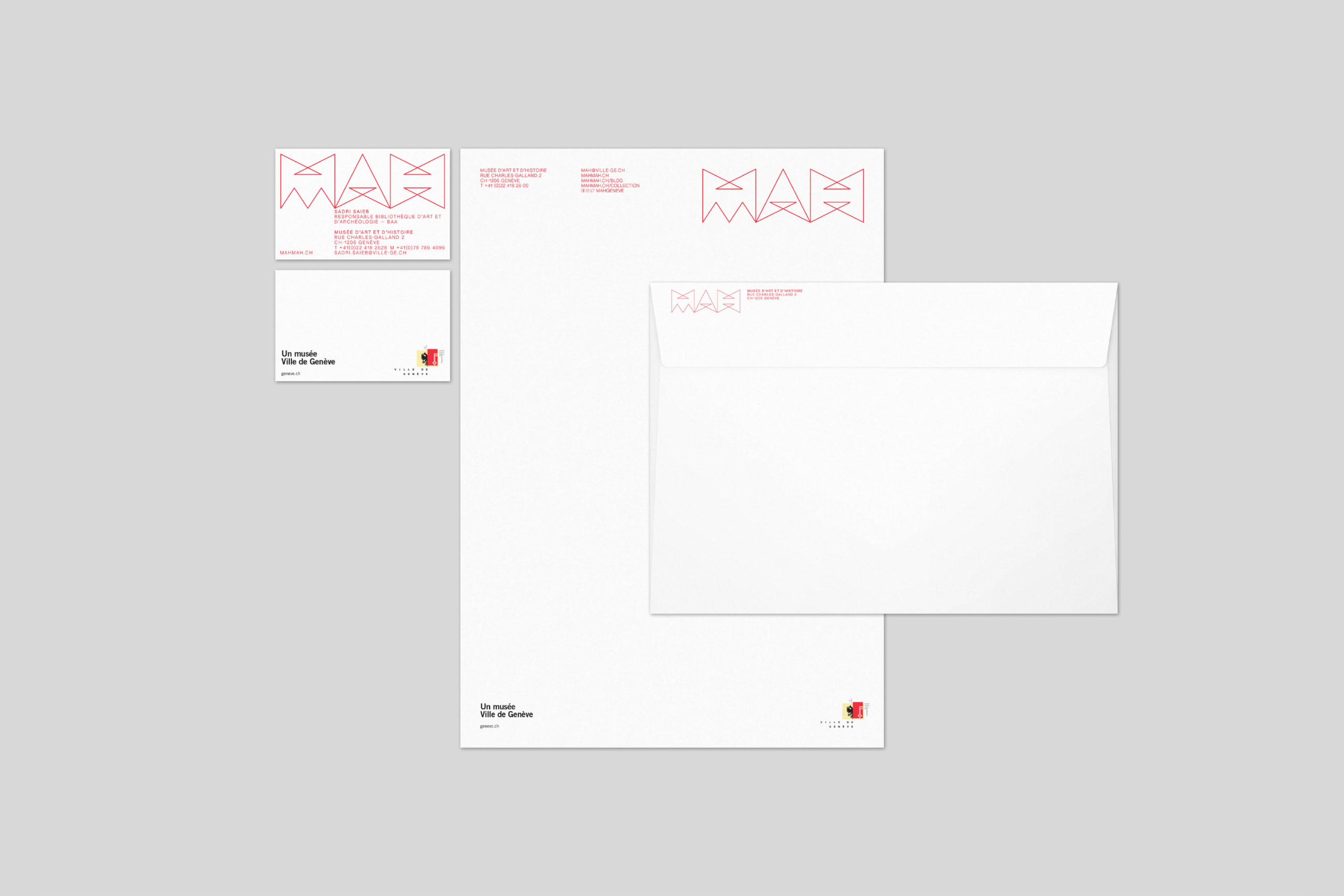
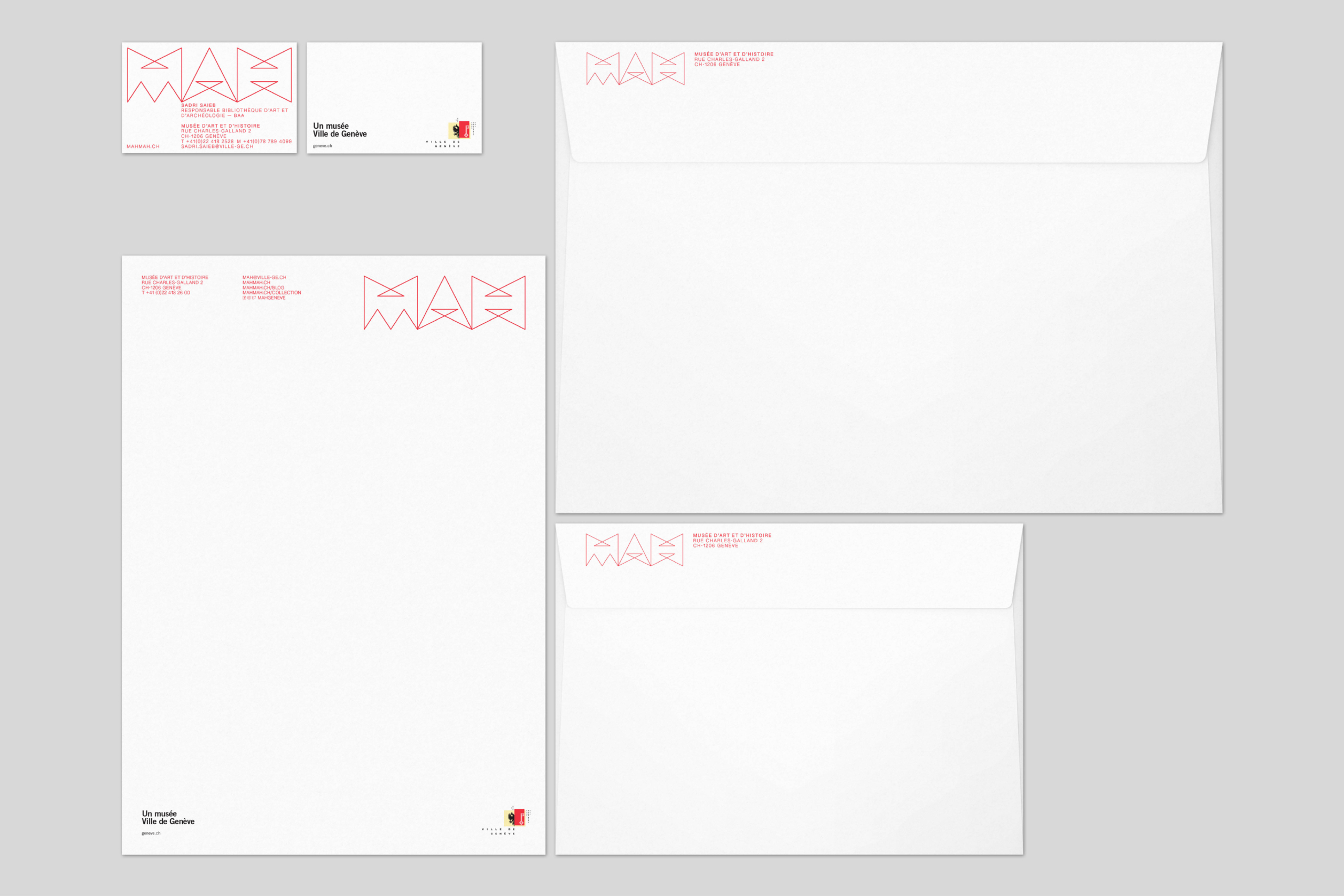
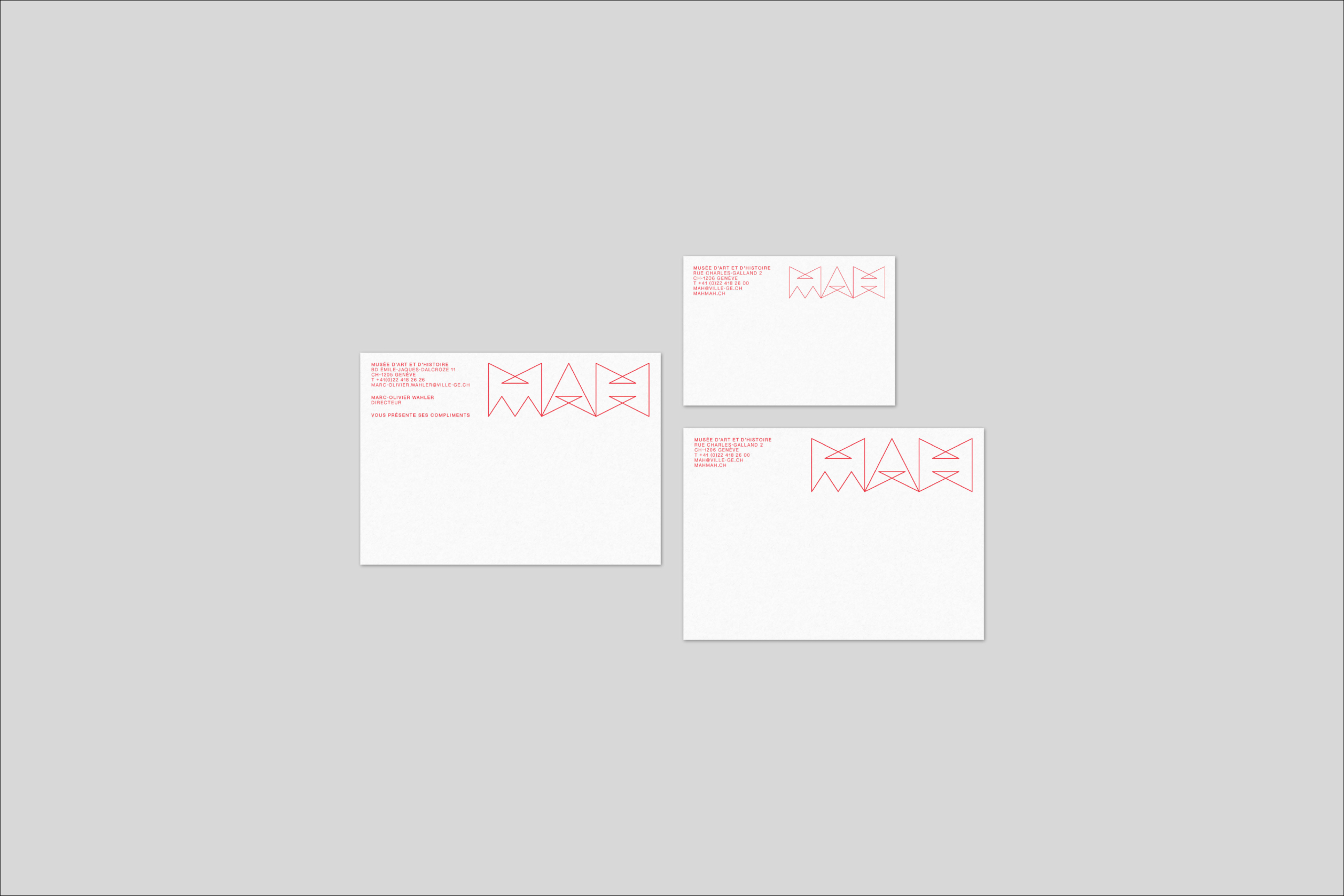
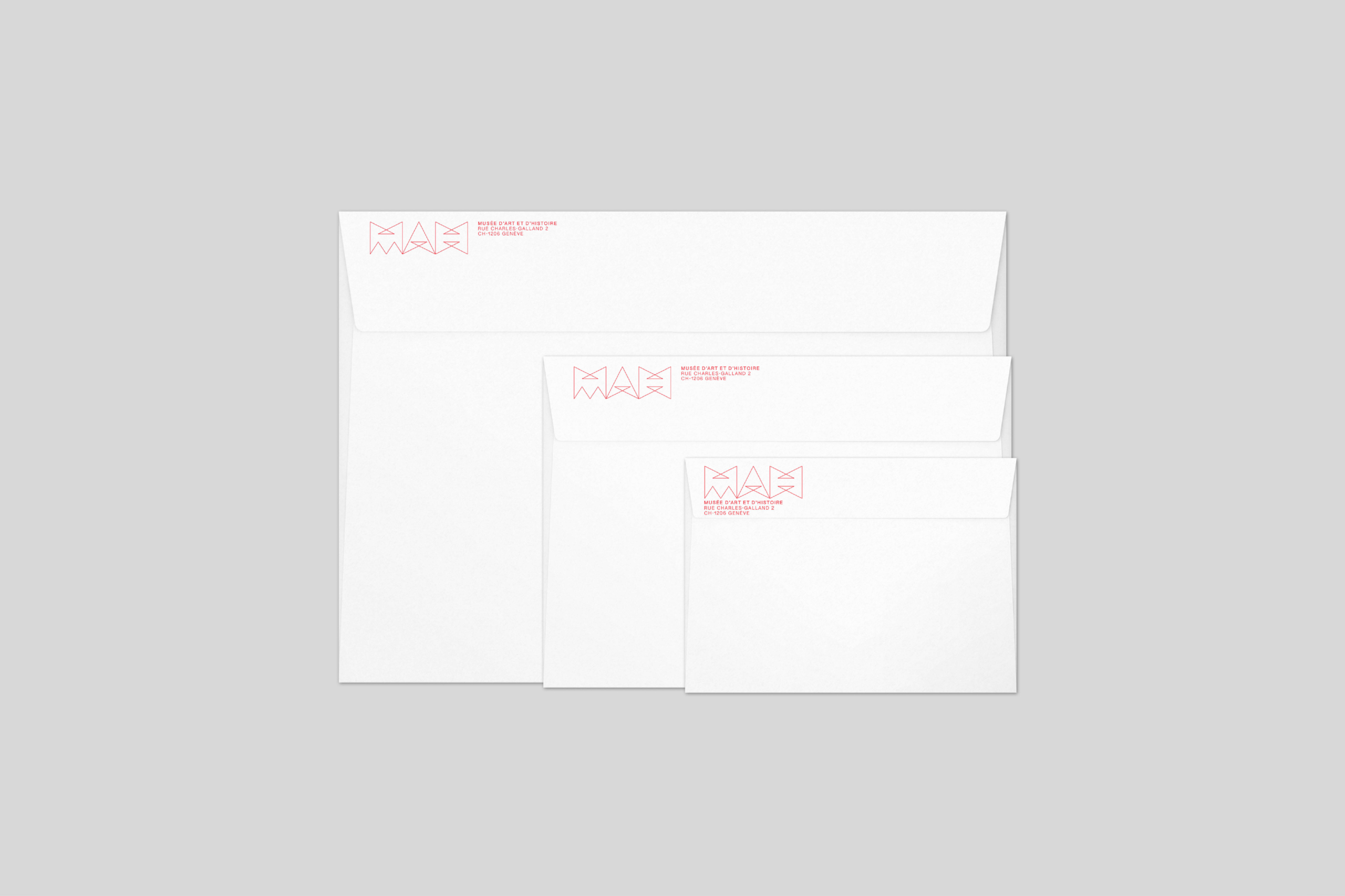
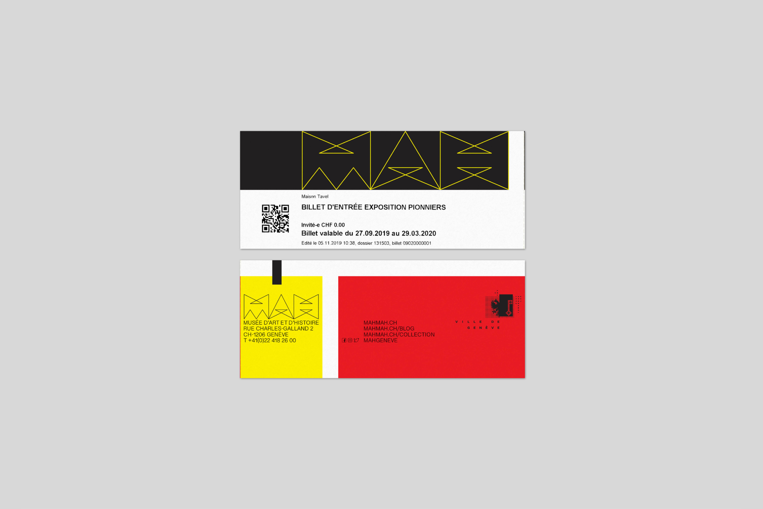
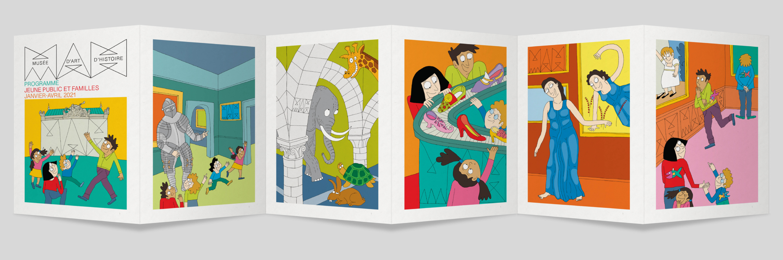
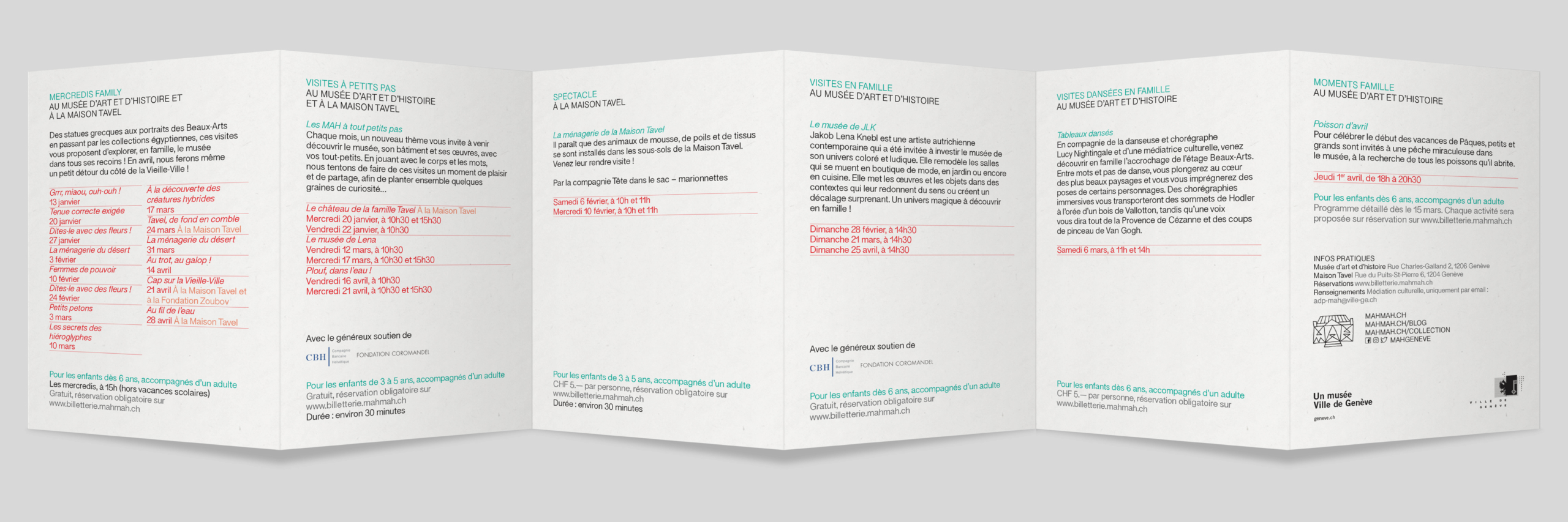
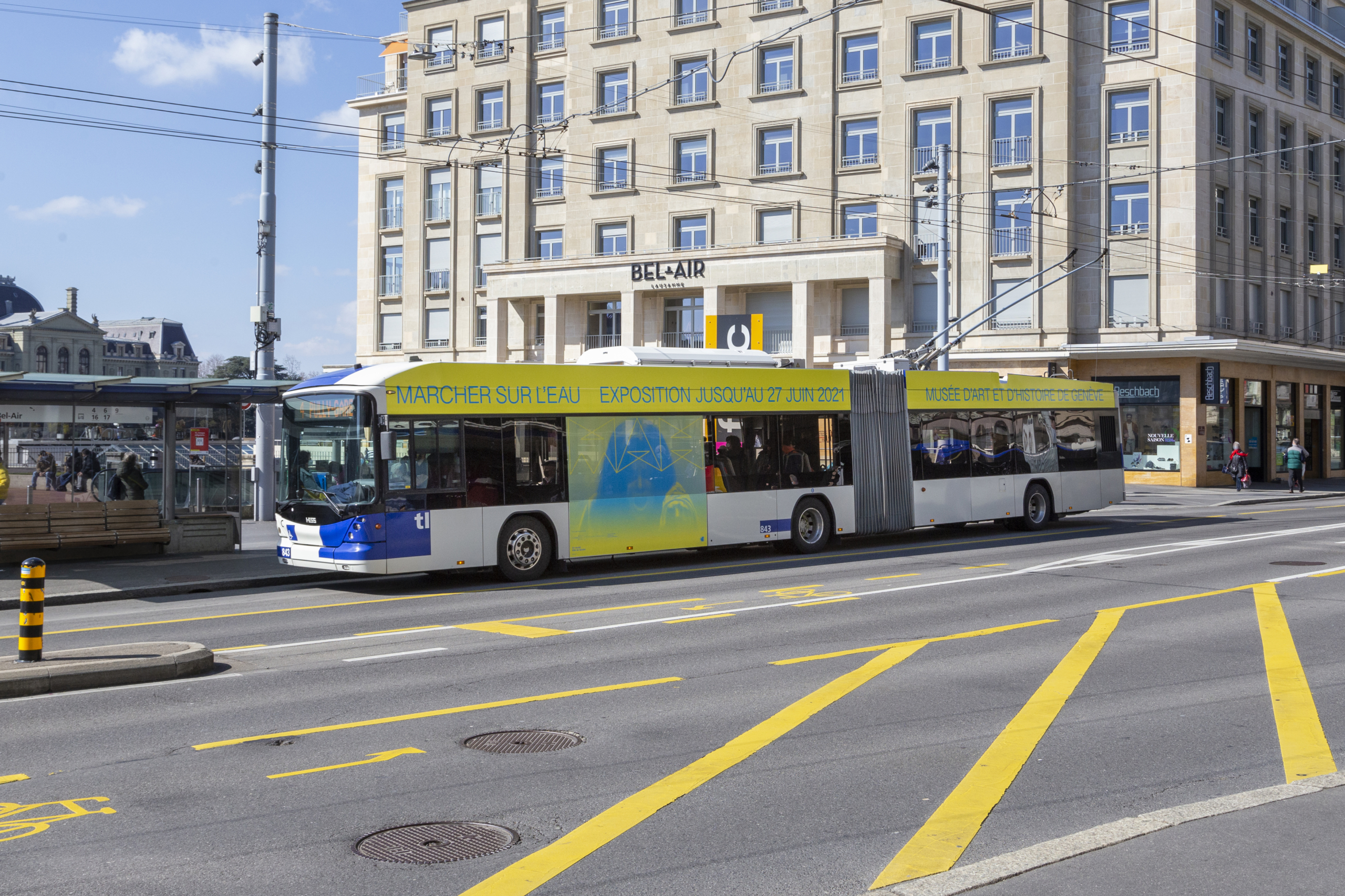
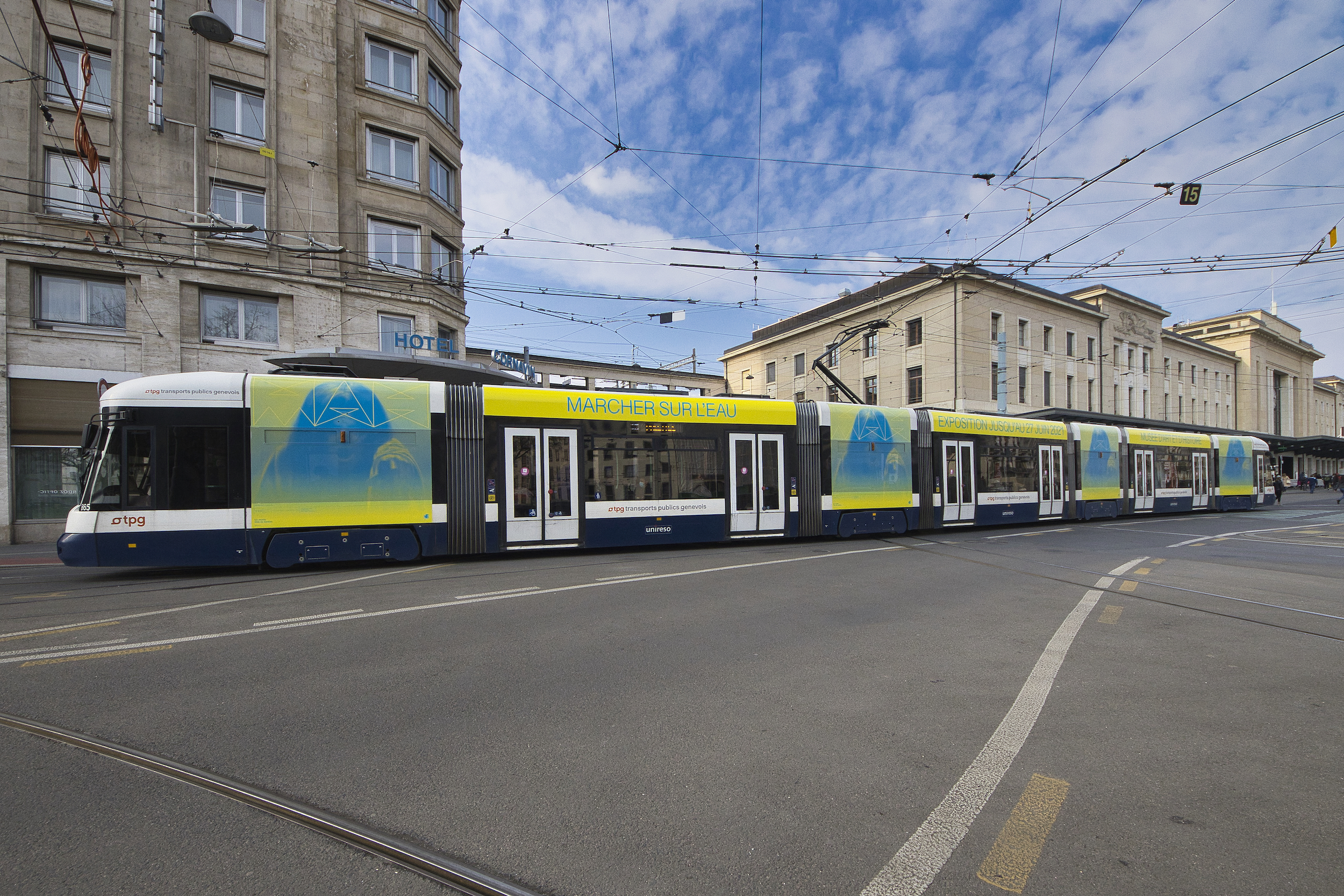
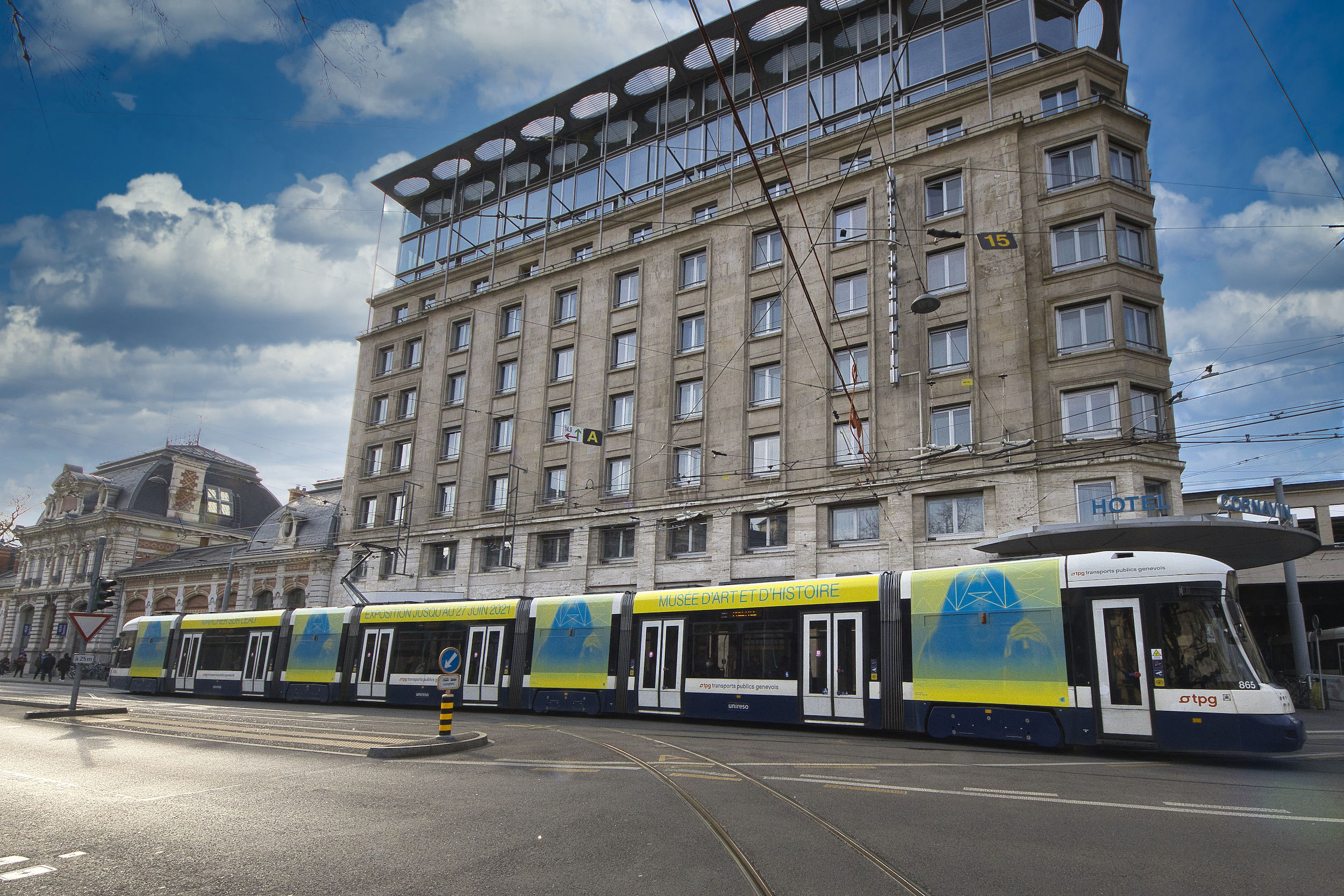
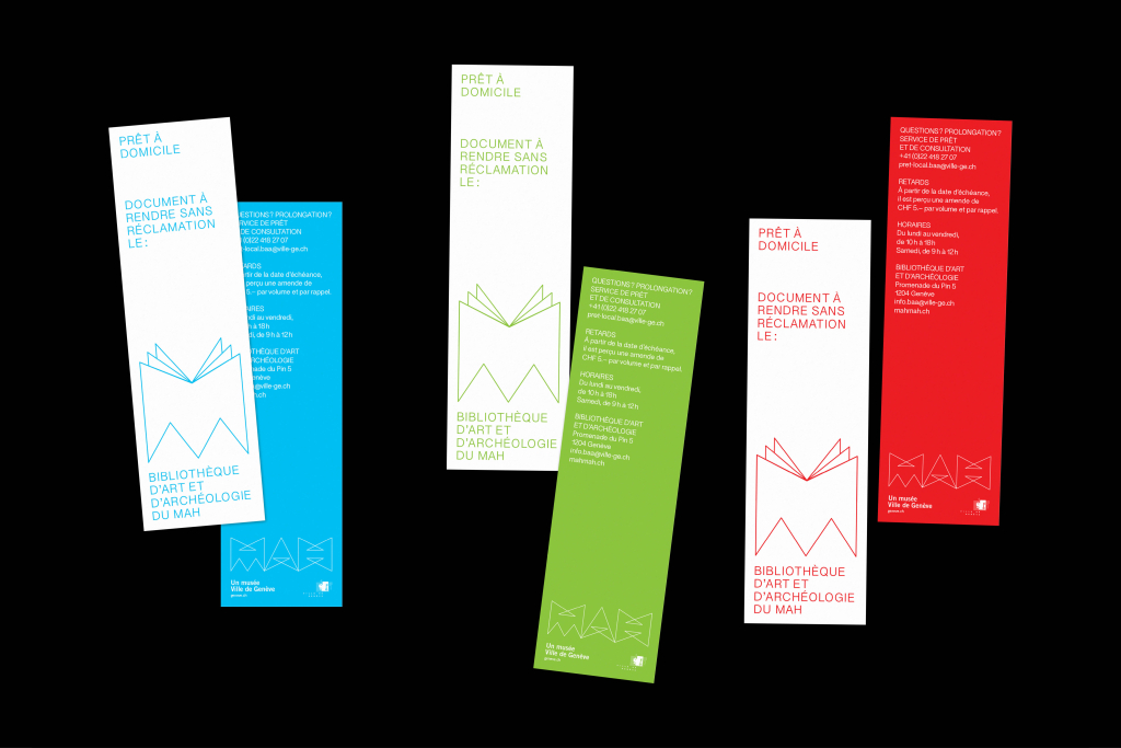
Design and development of the new corporate identity of the Musée d’art et d’histoire Genève. From logo, image campaign, signage, posters and all touch-points, the complete interaction of the individual media players was developed and implemented from scratch.
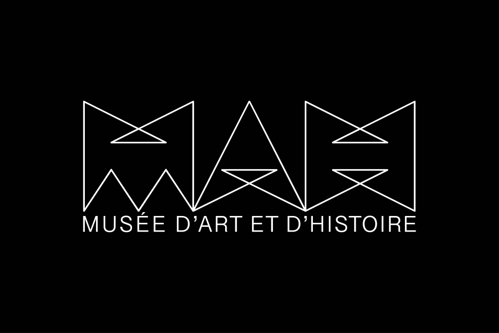
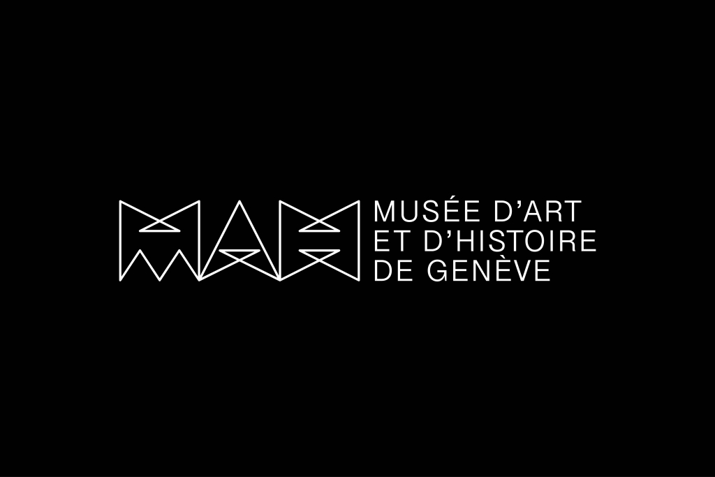
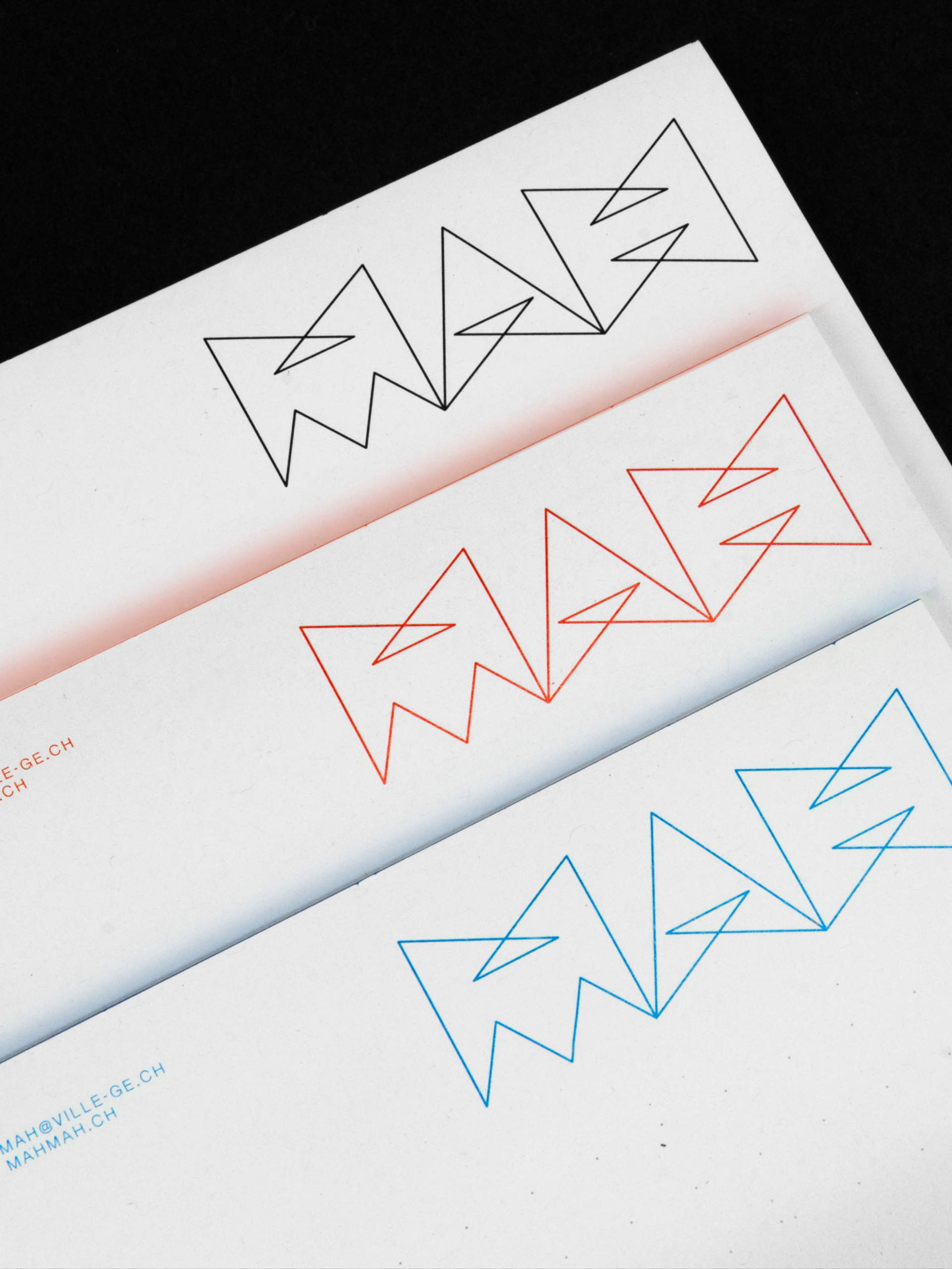
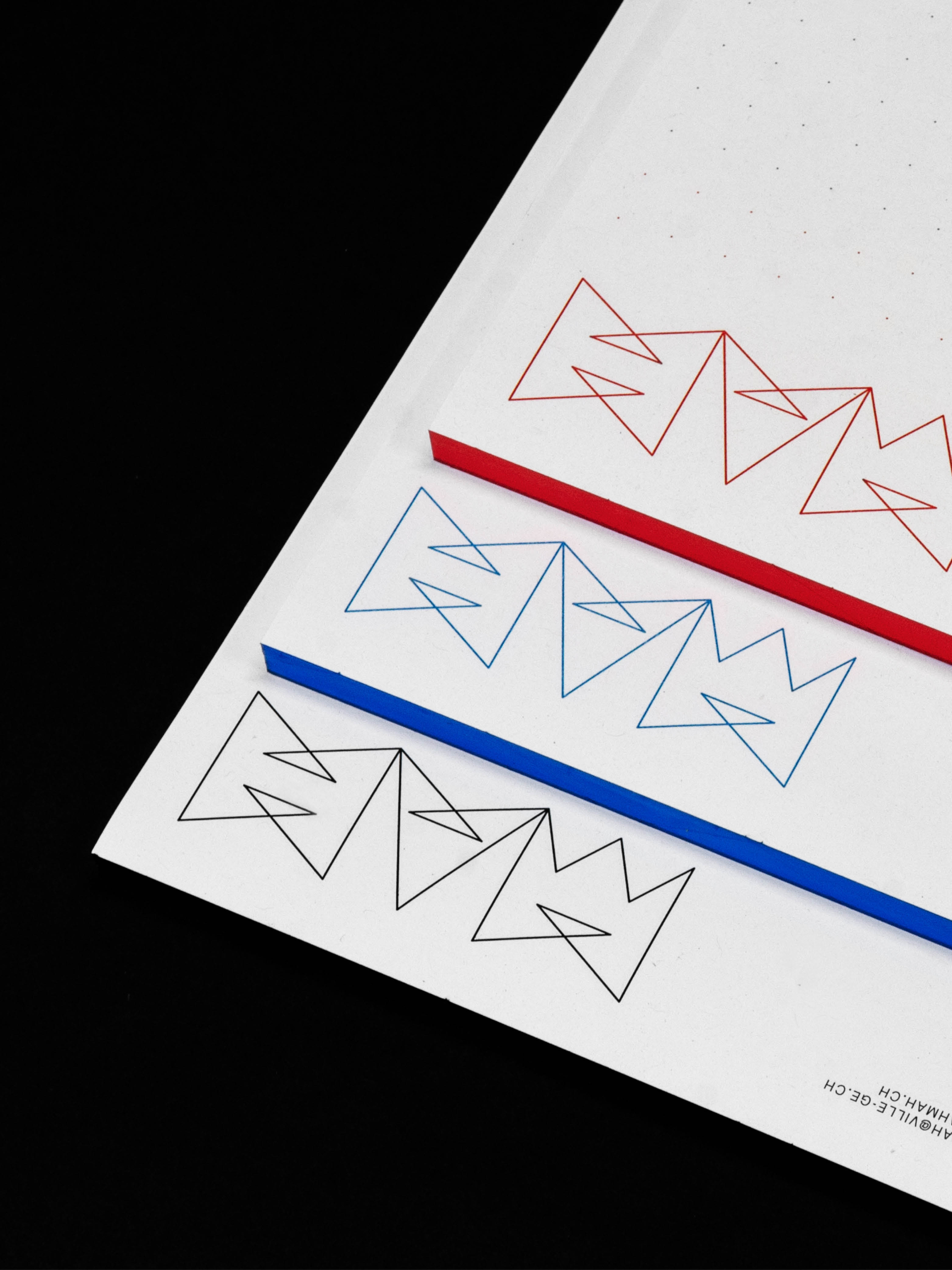
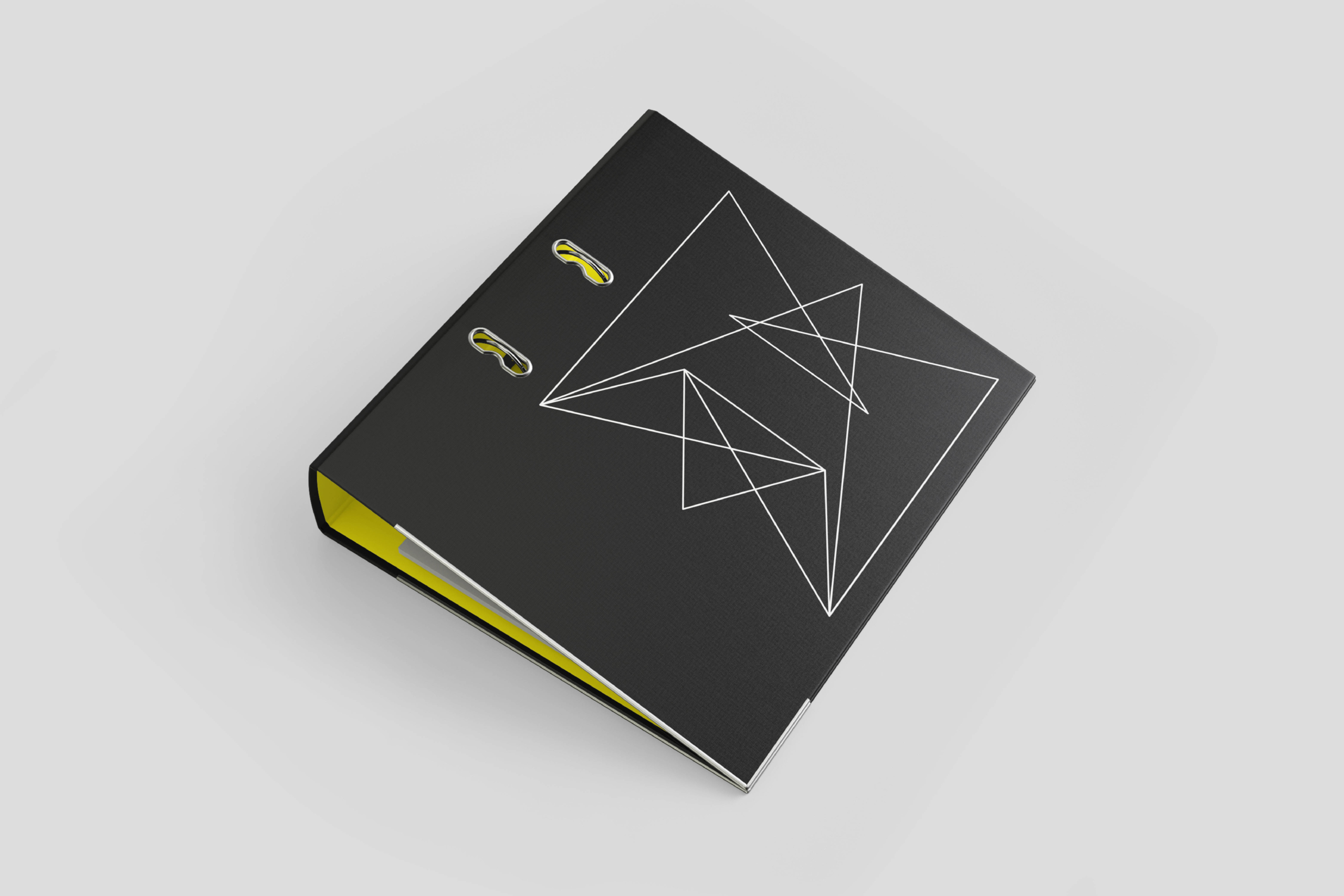
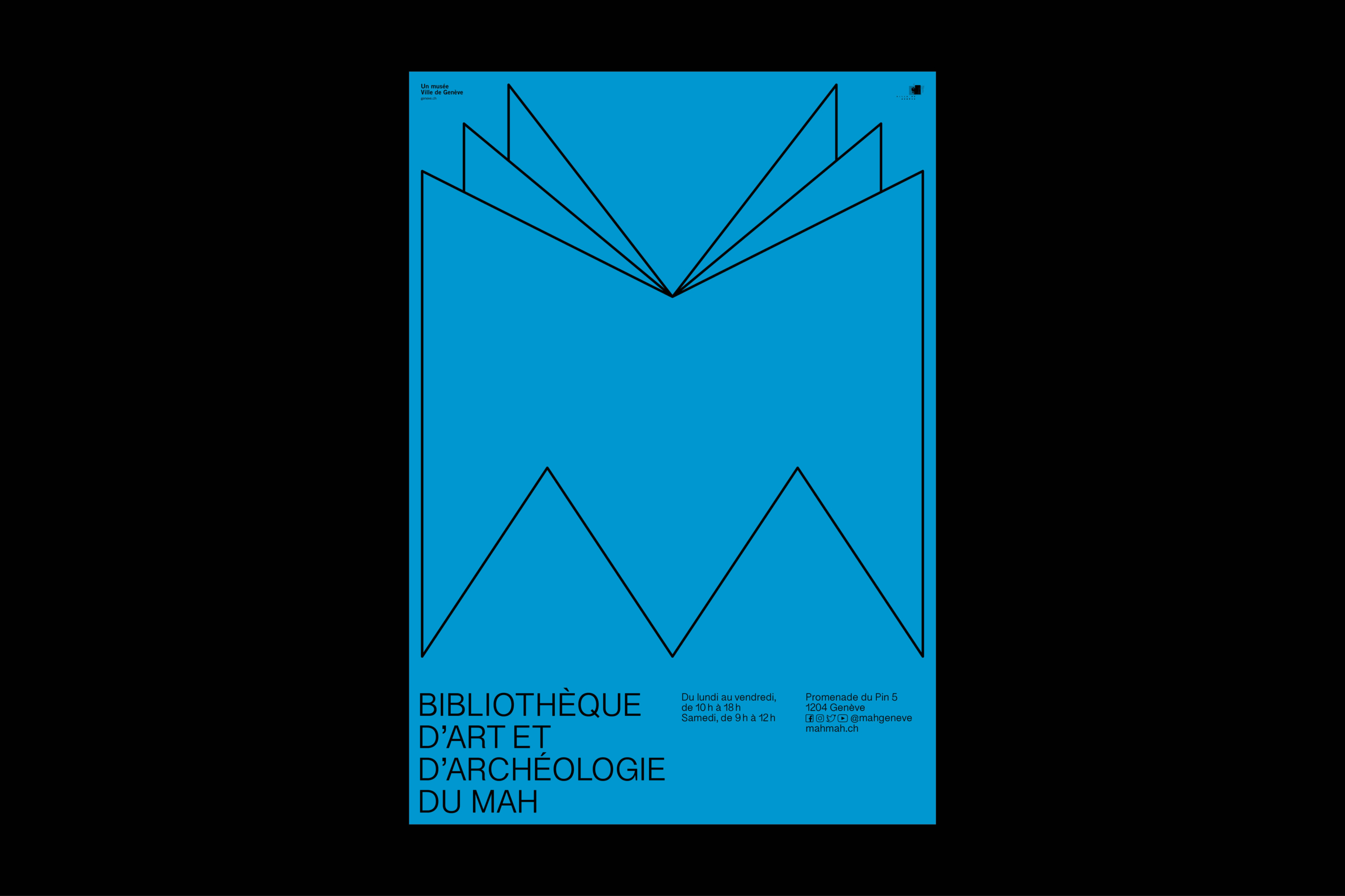
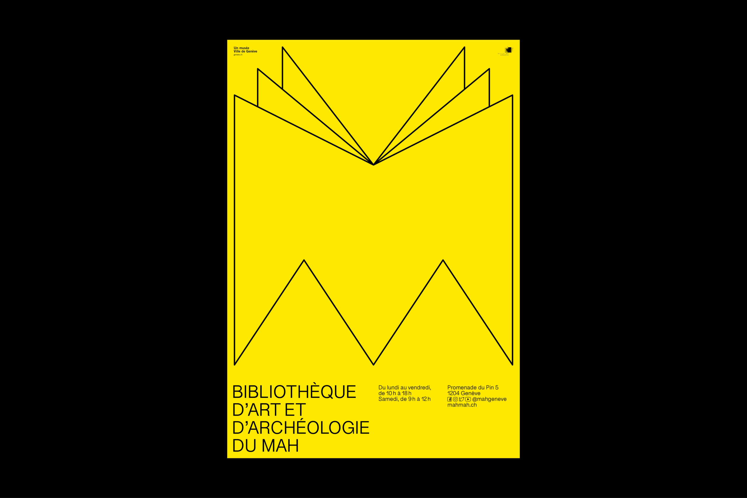
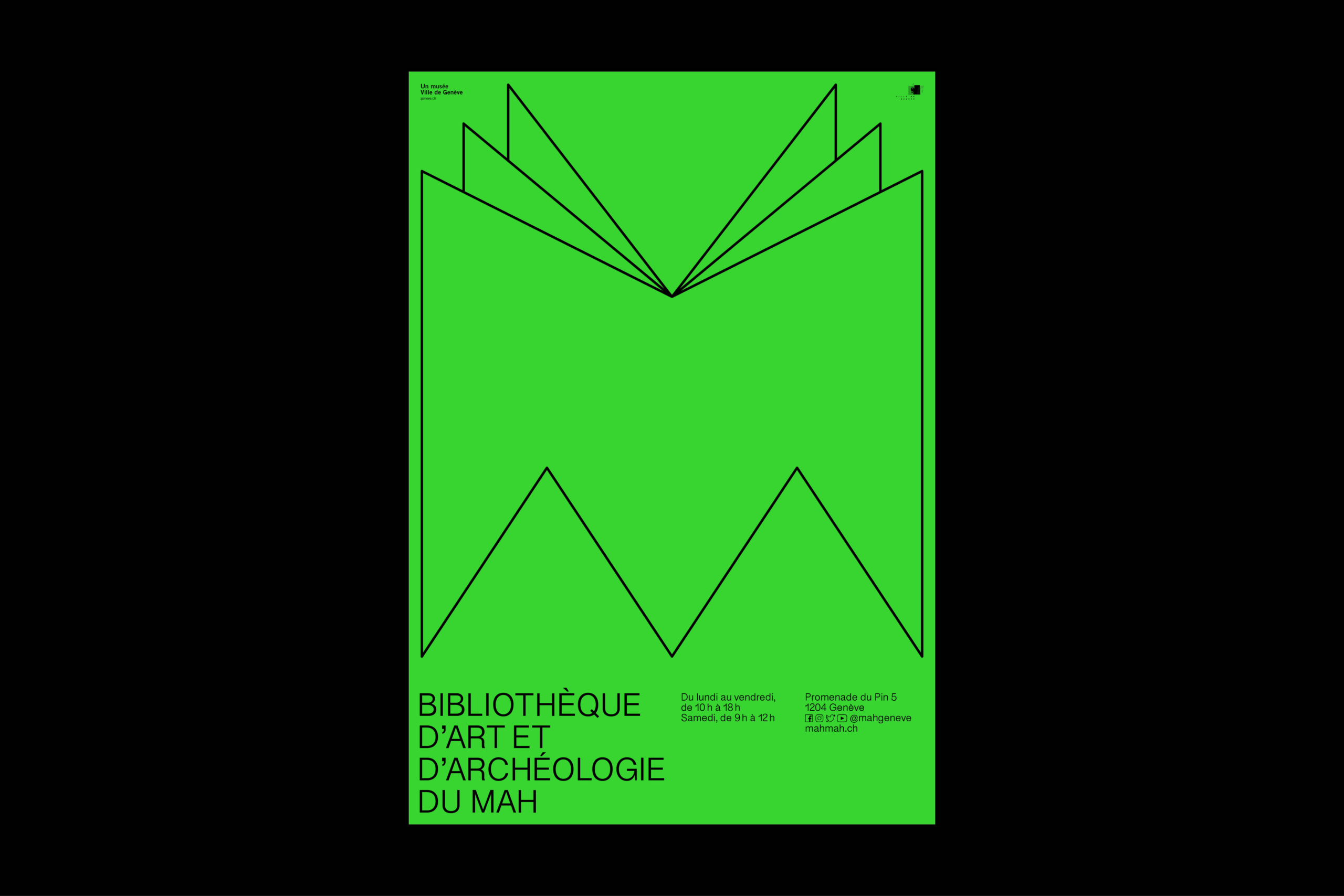
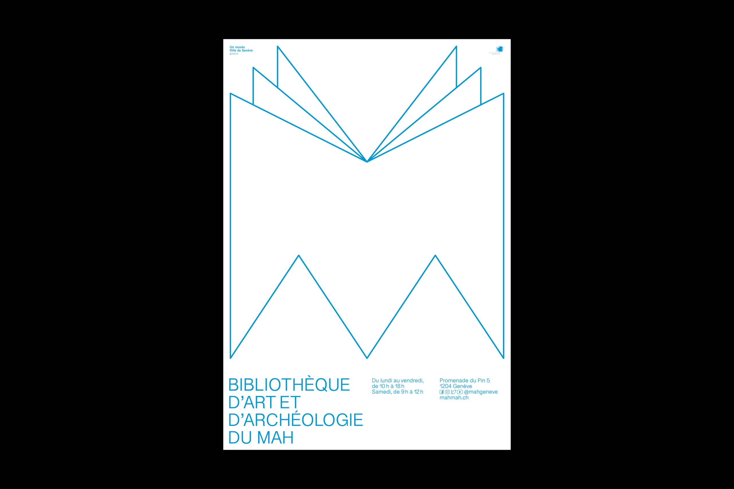
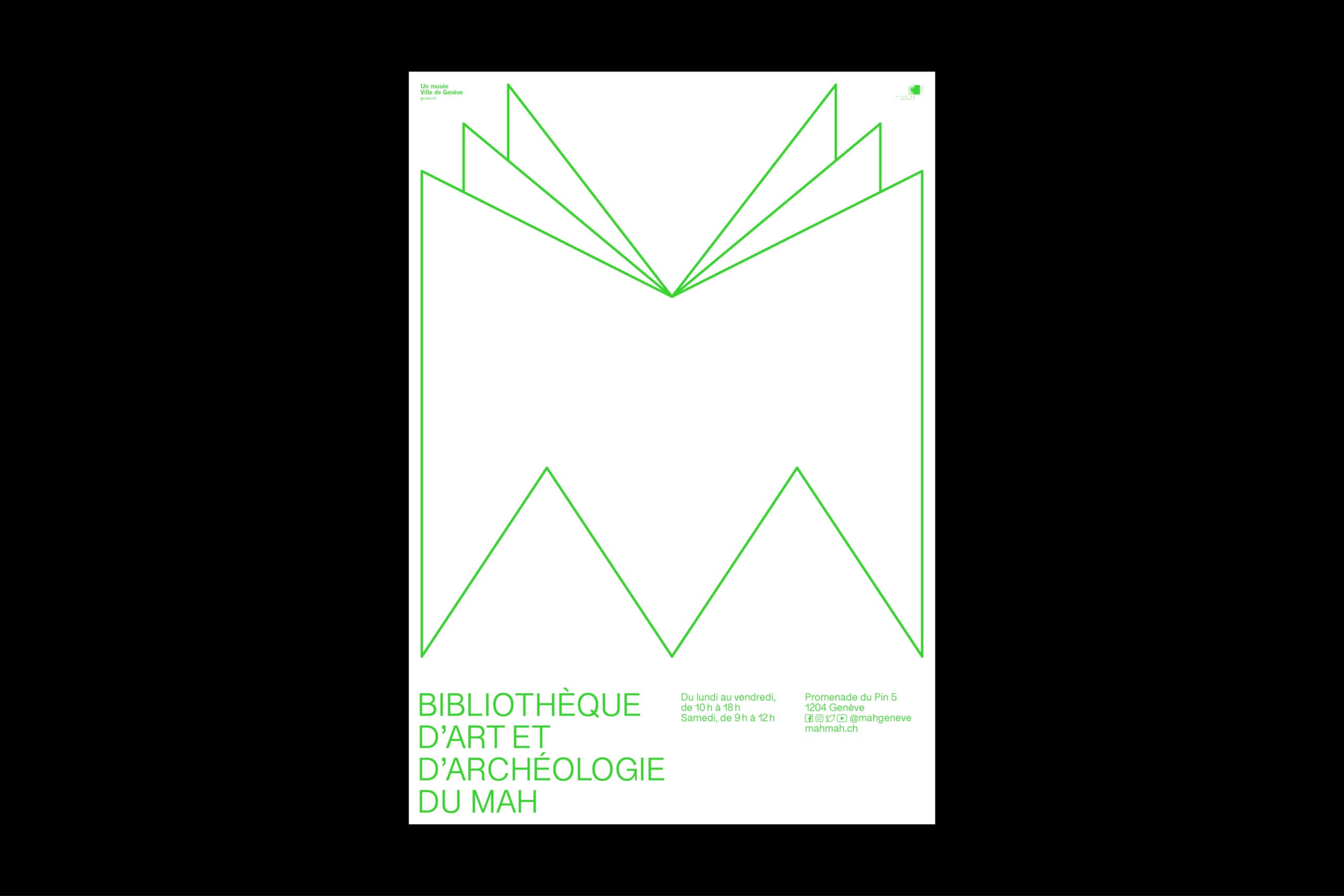
On the new MAH logo; In its formal and aesthetic appearance, the new MAH logo builds a historical bridge, a leap in time, from the engraving of a cuneiform script to a pictorial sign of the zodiac. It is therefore language and sign in one.
The gesture of the one-liner is to be incorporated as an important and identity-giving feature. The logo can be pulled and drawn without lifting the pencil, with a sweep of a line. It is based on the smallest units of the dot and the curve before being stretched out into space. The line and the shape created by it, provides the metaphor of a path, a transformation in space and time – as a museum visit should.
As a hybrid sign, MAH fits in between the usual categories of a word and figurative mark. On the one hand there are the letters M A H, on the other hand they are characterised by an iconographic quality that corresponds to the convention of a figurative sign. The proportions of the logo are responsive to the respective application formats and suitable for both large and small applications.
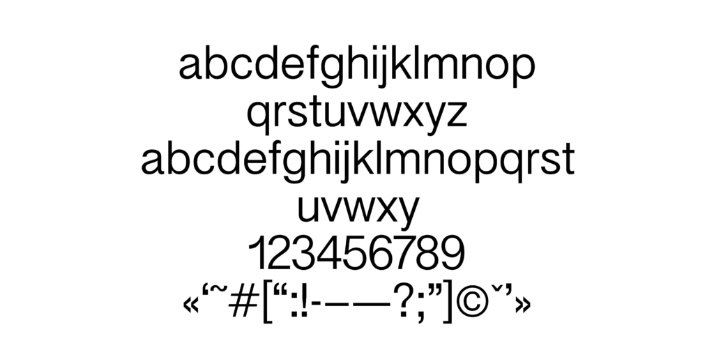
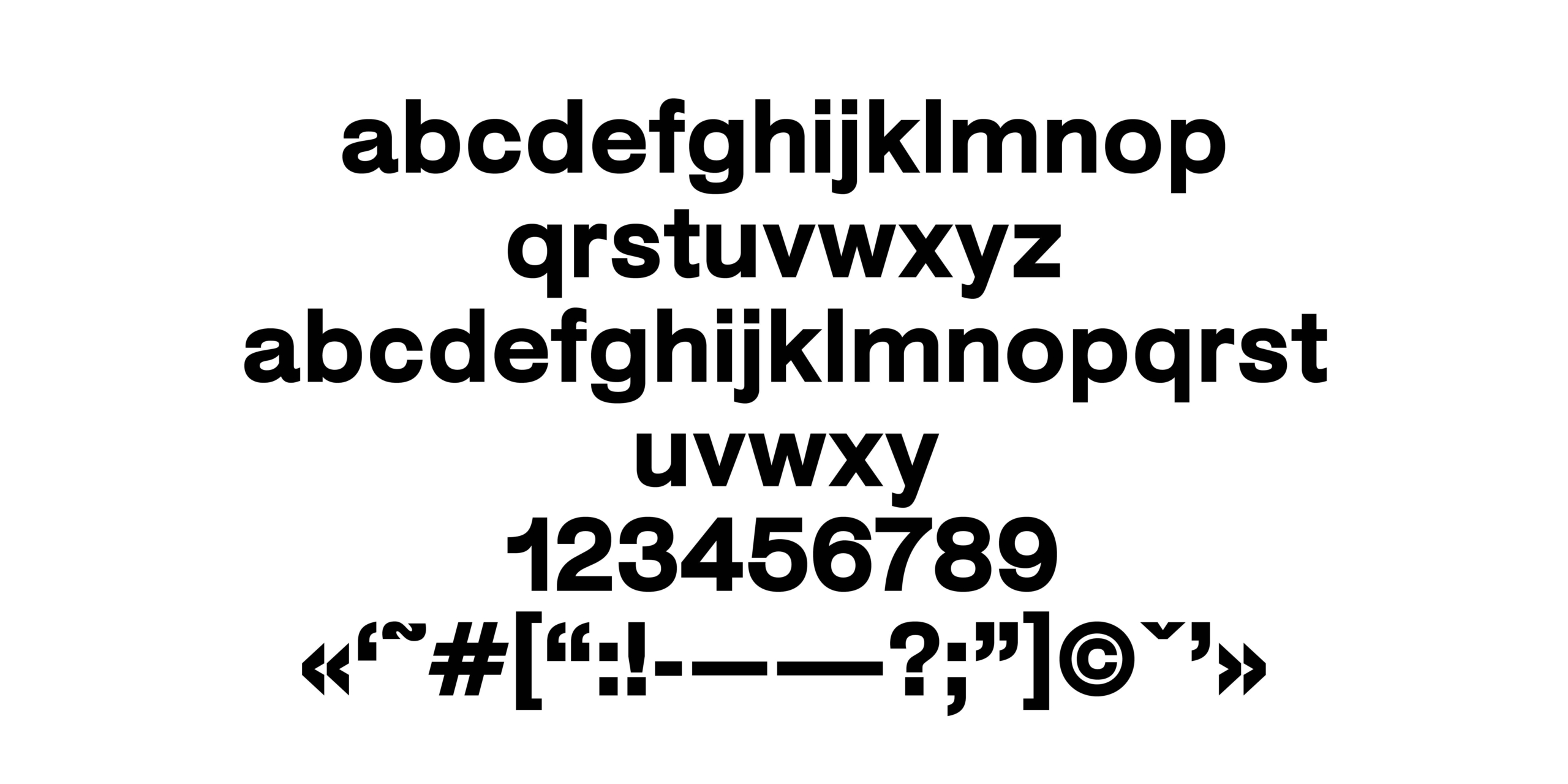
The sans-serif font, which was specially designed for MAH, conceptualises the contemporary demand for a timeless and discreet typeface. MAH-Sans is available in 6 weights and draws a light, fresh appearance that combines with the linear characteristics of the logo. The font application follows a functional, unpretentious attitude, it distances itself and serves the contents to be transported in an optimal way. Taking into account the latest technological developments, the typeface becomes an identity-forming and work process-optimising tool.