Andreas Abegg & Partner
About
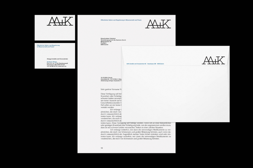
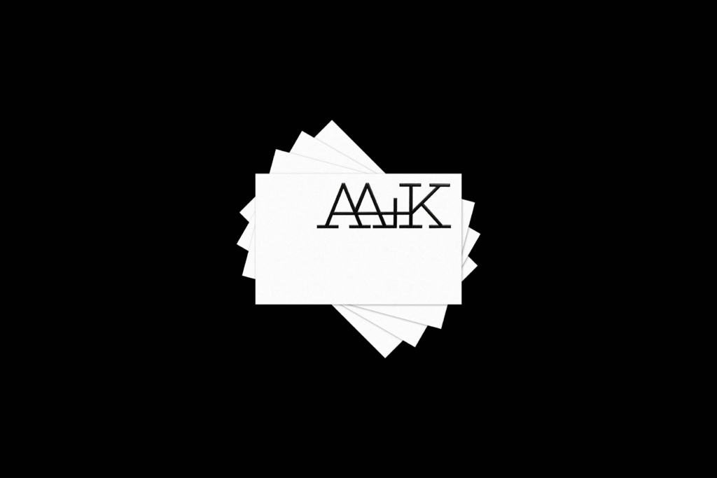
The appearance of the law firm is based on the newly developed logo design. The logo uses a specially designed slab serif typeface, which is inspired by the classic Gramond in its proportions, but at the same time follows a modern, monolinear tradition. A distinctive AA ligature connects the two letters of the logo and gives the design an elegant and professional look.
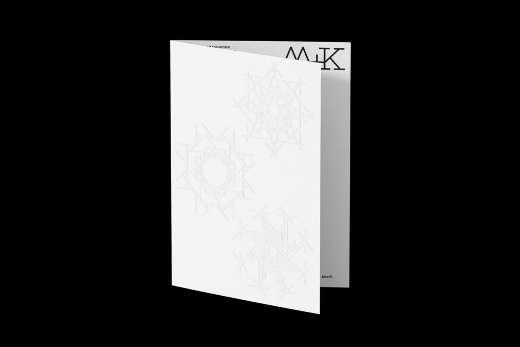
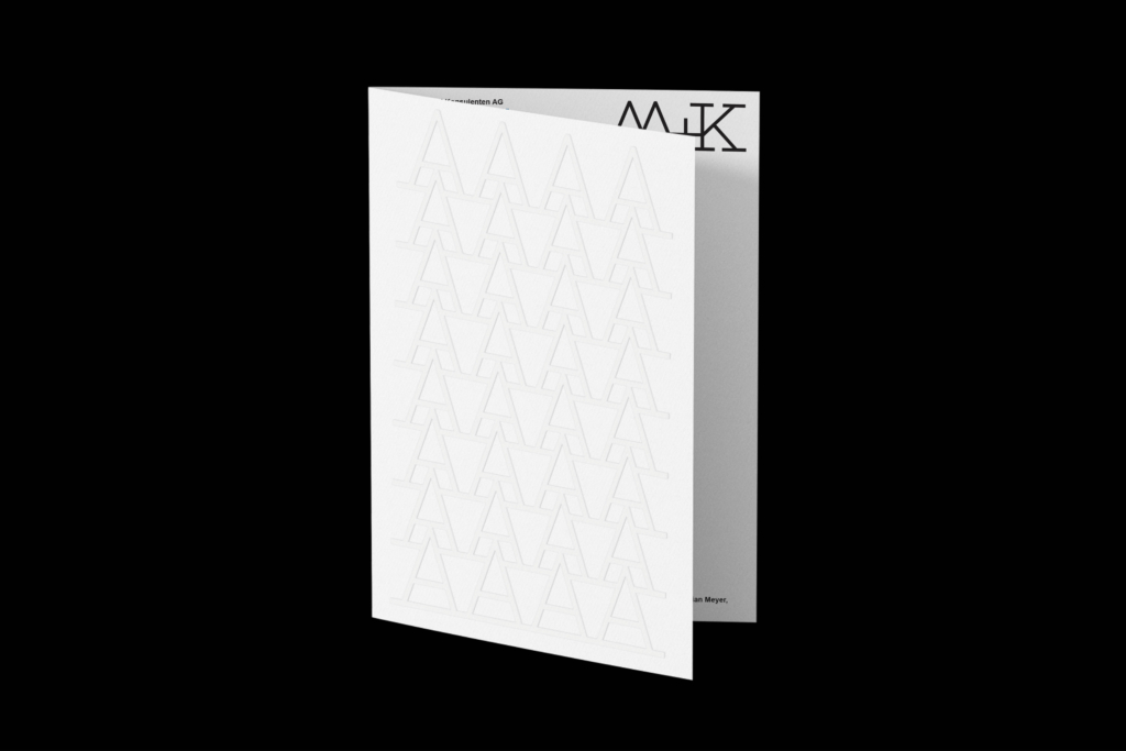
The corporate identity runs through all of the law firm’s stationery and ensures a unified and consistent brand presence. Letterhead, business cards and other official documents are all designed in the same font to ensure a uniform and memorable appearance.
The corporate identity colour palette is elegant and serious and consists of dark tones such as navy blue and grey. These colours are used throughout the law firm’s website to reinforce the brand and ensure a consistent look.


